Evaluation
The main difficulty I had with this brief was that I had the freedom of making whatever app I wanted while at the same time being restricted by existing apps and uninteresting ideas. This made me get stuck because I couldn't come up with good enough ideas that could be developed further or seemed interesting enough for people to use, or the ideas already existed. I had the option of redesigning an existing app but I didn’t want to do this because I wanted to make use of this opportunity to make something I’m interested in, and have fun with it.
One of the things that helped me finally have an idea was when one of my tutors told us to think about what we would like our phones to do that they don’t do. This led me to identify a problem I experience, which was procrastination. Since I was stuck I kept avoiding the work and doing something else which only made it worse, so I thought what if I had an app that kept me on track and didn’t let me get distracted.
When creating the app I wanted to make something that was almost like a guardian of deadlines but also your friend. Which led me to making the app a character with a personality, that is fun and likeable so even though he keeps bugging you to work you don't get annoyed at it and delete it.
One of the things I think worked well was bringing this nono character to life. His simple design allowed him to be implemented throughout the app, making the style consistent and allowing him to have a presence. Nono can be seen not only on the logo but also on the other app icons, emoticons and audio player. Which leads to the second aspects I am happy with, I liked how I was able to keep a consistent style with the different app icons and avoided making them look like clipart, and instead look fun and personalised. Similarly I think the emojis provided both nono and the user another level of expression that distinguished the app and the experience of using it from other apps.
Additionally I also think the animation for the demo, showed how the different elements of the app would work visually nicely for example the audio moving. On the other hand the video player wasn't as successful but that was because I did it first so the technique wasn't right. Additionally maybe I should have added a light blue full screen background like I did for the photo and pdf page.
Similarly despite the animation showing the visuals well I think I should have included some written explanations onto the demo video to make it more clear in a promo style. Also add some background music to make it more fun since the silent atmosphere doesn't reflect the app. Another thing I would fix is the colours, I accidentally saved the image file with the wrong setting so it made the colours dull. Also maybe I could have created a mock up of the text message that nono sends with the code of distraction which allows the user to a unblock the apps.
Something that I found really helpful and enjoyed about this course was the friendly atmosphere in our frequent presentations. The class engaged with what each person had to show and gave feedback in a relaxed way that helped me develop my idea further, keep on track and feel comfortable and confident to share with the rest of the class.
Overall this brief really helped me become more familiar with designing an app and the difficulty of coming up with a good enough idea for it. Additionally it also helped me improve my editing skills on after effects, I was able to discover quicker and easier ways to do things that I would take the longer route to do before, such as creating separate compositions for separate pages.
Final App Demo
Final Digital Poster
Links to the photos I used in my final:
https://www.pexels.com/photo/desk-laptop-notebook-pen-3059/
https://pixabay.com/en/boy-portrait-beard-eye-about-1252990/
https://pixabay.com/en/blogging-computer-female-girl-15968/
https://pixabay.com/en/girl-happy-laughing-dancing-nature-593194/
https://pixabay.com/en/friendship-girl-white-black-forest-1058565/
Digital Poster Vector Illustrations
1-Final outcomes
2- I created the vector illustrations from scratch. I wanted to represent different types of distractions so the control means video games, the TV that looked like a computer so I added a controller and DVD player to make it less PC-ish,, means TV shows, the phone with a heart stand for a call from someone you care about, family, friend, lover and the last one stand for a party or going out which I had the most difficulty representing which caused it to turn out quite busy unlike the other which or more simple-although the TV could be simpler maybe.
3- Initially I was gonna add a red ring around the circles since its one of the colours for YUPYUP but I found that it was too much and since he is in the video there doesn't need to be anything that hits at his presence.
4- Shows the different layers used to make the poster.
My Final App Pages
|
4- The red one shows how my initial design looked and the two profile s on the right are what the final design looks like. In terms of the two finals the only difference is the profile icon, one is a girl and the other is a boy. This would be the default until the user uploads their own photo.
In terms of the profile page I wanted to make the main information look like a student ID card since the app is mainly targeted at students. But also because it represents the user becoming part of the That's nono community (since the downloaded it) and they are now a member of the working hard crew. I looked at some examples for reference--> 7- The first screen is the initial design for the task however it was too squashy and made selecting on the phone difficult so I added more space between the different options which is the 2nd and final one. The third shows how the page would be if the tasks were minimised and the 4th image shows what happens when you scrolls down the page, you find more arenas. |
|
My Final Emojis
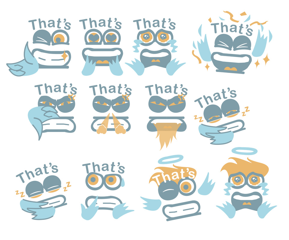
These are all final emoji design I created from scratch for the app. However not all of them were used in final app, for example in the second row the first three are trying to represent bad mood or angry but based on the feedback I received the one that worked best was the third one with the fire.
Similarly the final emoji chosen for tired was the fourth one in the second from. Initially it was going to be the first one in the third row but it looks more like its sleeping rather than just tired.
The last two with hair are not actually emoticons they are a more expressive for of nono used in the arenas. If tis was a real app Nono would have additional emotions for the different stages of the battle which would all have hair since its a characteristic that gives him more life outside of just a logo.
Research into existing emoji styles
I looked at different styles of emojis outside of the standard circle ones for the iPhone because I wanted to make something more expressive and exaggerated. This would allow the emoticons to reflect not only the users feelings but also nono's character.
Also since the emoticons would be animated it needed more elements to move in order to make it fun to use and engaging.
Also since the emoticons would be animated it needed more elements to move in order to make it fun to use and engaging.
Timetable and timeline references
Before creating my schedule page I looked at different styles online and tried to pick out elements that I liked and fitted with the existing visual of my app. The ones that influenced my final schedule design was 1 and 2.
App Icons and Menus
1- Shows the different icons I made for the menus and apps.
2- These are the different menus i created for my app.
The top one is for the timeline battles. The task categories are divided by:
Goals, Personal appointments, Chores and School Work.
the second menu is for the study squad page. The symbols represent different file types you can upload:
Audio, Video,Text/PDF and Photo.
The third menu is for the opening page. This is where you turn on the app's main function and add the That's nono app menu to the iPhones shortcut menu. The middle icon is notifications and the last one is for general settings.
3- Shows the development of the main buttons for the apps to function, and how they changed not only in style but also in name.
The top row are the eye styles I dropped since they didn't work for expressing the right emotion or fit with the rest.
Code of distraction, refers to the password the app 'nono' sends to the user once the time the set up for the app to block other distracting apps is up. It is also sent to a back up account in case of emergencies.
I decided on this name because distraction sounds like destruction and in this case distraction is destroying productivity. So once the user is done with the most urgent work they can go back to getting distracted.
Development of Study Squad PAge Layout
YUP yup Character Development
YUP YUP just like nono is made up of the letters used in their names. I wanted to maintain a consistent style between them and allow the shapes of the letters to determine their appearance.
1- Shows the different combinations I found for the letter positioning. With no additional characteristics.
2- Shows my different attempts at adding more character to this initial simple line designs by apply YUPYUP's colours and adding some additional shapes and modifying the original form of the letters.
The last column shows the ones that worked best.
3-I did the same for this one eye design however when I presented to the class they preferred the two eye version, which I did also.
4-These are the final designs for YUPYUP he can alternate between them just like nono has different forms to express emotion.
5- This was another character idea for the "evil" YUPYUP but it was called CanDo instead. However I dropped it because it looked like a different style from the rest of the app and the main good guy nono.
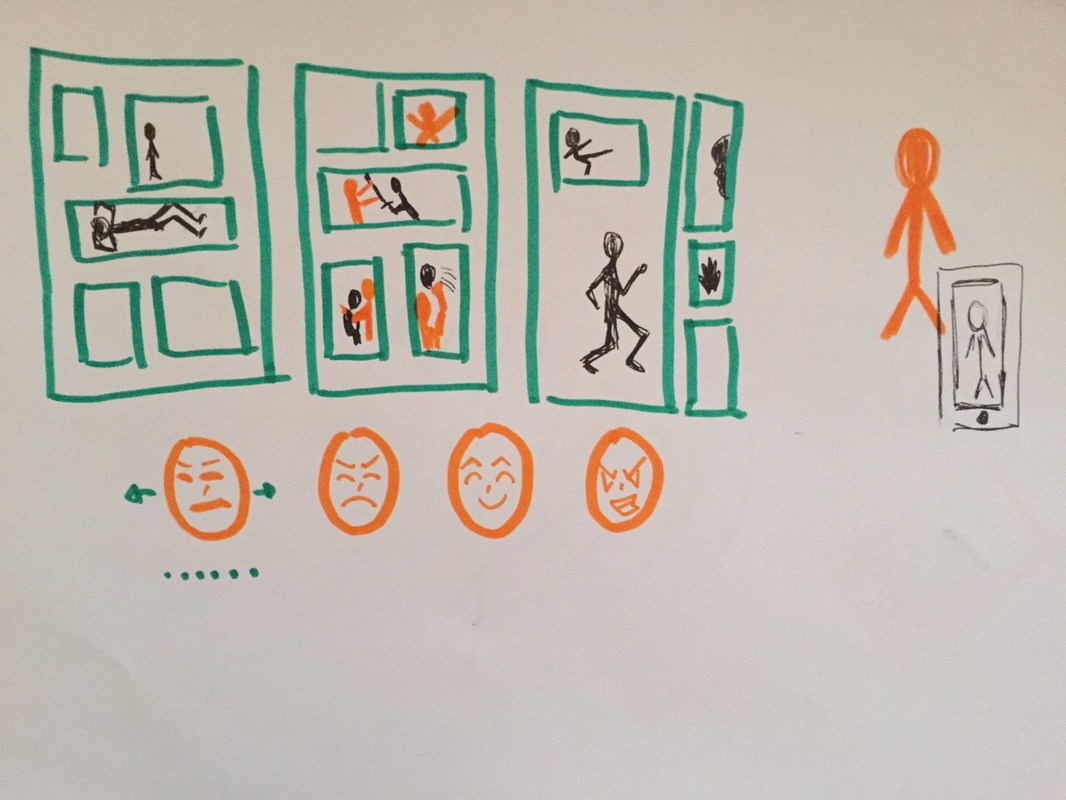
Draft Poster ideas and app
At first tried to visualise the concept of the angel and little devil one telling you to study and the other telling you not to, like in cartoons. It didn't really work because it wasn't clear if they were distracted because for example the skateboarder, maybe that his career so in that case his not getting distracted, so I need to think more carefully about the imaginary.
When making the video version I decided that adding the phone might make the source of distraction clearer. The animation also helped me play around with the idea that nono is a guardian not letting YUPYUP tempt the user to distract themselves.
This is just a quick animation I did using what I learned in class to see how the pages I have so far look on the phone.
This is an exercise we did in class for tracking and finding things in the app. I don't really need this for my app but its still a useful skill to have I actually used it for another project.
So I tried to find anywhere where this kind of effect might be relevant with my app. So I came up with the pretend function of tracking study squad members for days where you wan tot meet up somewhere to do group projects.
So I tried to find anywhere where this kind of effect might be relevant with my app. So I came up with the pretend function of tracking study squad members for days where you wan tot meet up somewhere to do group projects.
App Logo and Icon
1- These are the different versions of the app icon that I made. The final one is the last one.
2. The black one is what nono looked like originally before I started to personalise him.
The rest show a development of emotion/expression except for the 2nd row.
row one is annoyed
row 3 is wink- which later development even more for the emoticons.
row four is tired.
The last one on the second row is actually suppose to be in the first row.
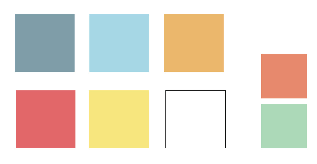
Colour Scheme
|
The red and yellow are the colours for YUPYUP
Dark and light blue and light orange is for nono the white is neutral, used to tone down the other brighter colours and create harmony and space. The dark orange and light green are the additional colours I had but I removed them because there were too many colours in my app. I chose blue as the main colour because it stands for: trust ,reliability and responsibility, perseverance, and peaceful. and orange because its optimistic, self-confident and suggests action and activity (in terms of getting work done other than get distracted) http://www.empower-yourself-with-color-psychology.com/color-blue.html http://www.empower-yourself-with-color-psychology.com/color-orange.html |
|
Existing Apps for reference
|
Audio Players
EatYourKimchi
|
Weebtoon Line
Instagram
|
Others:
Initial Ideas
Idea 1:
An app with existing templates of comic book pages separated by style, genre and poses. The templates can also be found through tags #SittingDown #BodySlam #RidingA Bike. The user is able to upload their initial or final character design choose the style of comic, genre or poses they intend to make their character a part of.
The app would then take their character design adapt it and generate a superimposed version of their character in those positions. This would allow the person to get a feel for how their own comic page would look like and if their current character design works with the genre and atmosphere they are aiming for.
The poses can also be used a reference material for when they draw their own characters later on. However the templates are examples only and cannot be used for uses outside the app e.g commercial.
Names: ComicMe, Comic Teaser, Teaser Image Maker, OC Visualiser, OC Klub, OC Trainer, OC School, ComicGenic
Draft Logo Idea:
How it might work?
In this sketch the orange represents the original character. So it shows him/her in the different positions on the page and showing different emotions, two of the different mock ups in the app.
Making Of Initial Idea Logos
1,2) For the ComicGenic logoI was trying to incorporate the layout found in comics, by placing the different letters inside the boxes.
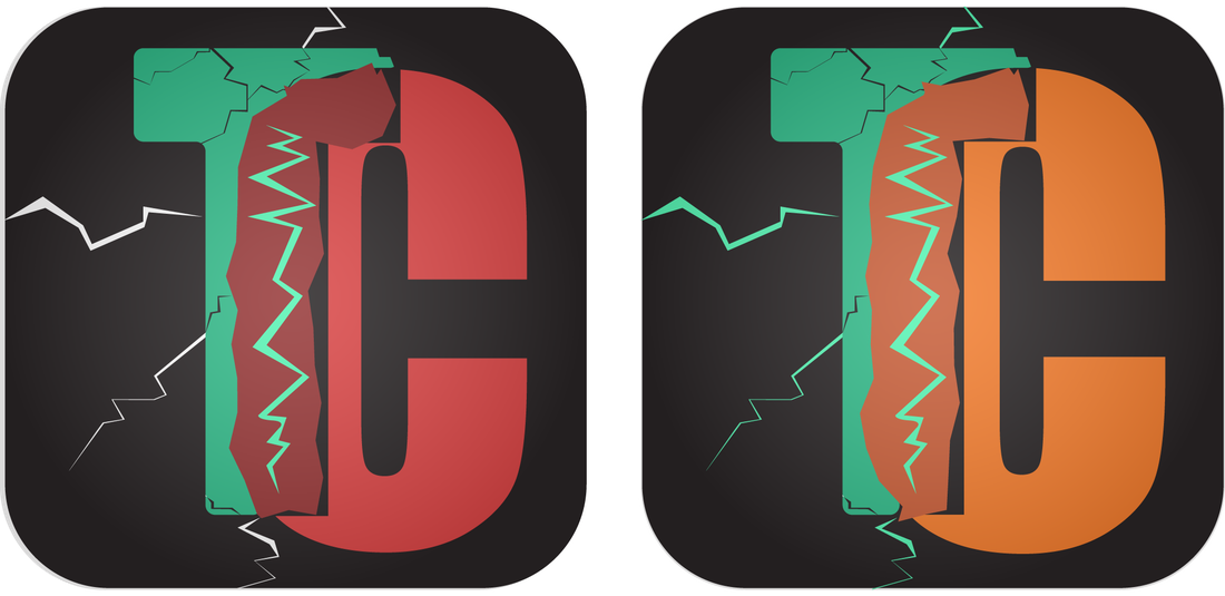
3) for TuneCrasher I overplayed the T and C to reflect how two phones combine in one playlist and speaker or one over powers the other to gain access to the speakers.
3) for TuneCrasher I overplayed the T and C to reflect how two phones combine in one playlist and speaker or one over powers the other to gain access to the speakers.
|
Idea 2: Pocket wardrobe Po-Drobe
The app organises your and other family members' wardrobes. Help you keep in track with what clothes you have sometimes you forget about a certain item since you haven't worn it in a while. Similarly the app would also keep you notified on how long it has been since you wore something. Also if you want to wear matching outfits with friends or borrow something you can connect wardrobes as long as they have the app as well. I decided to drop this Idea because it's to similar to other existing apps. Existing things called Drobe: http://www.drobe.lt/en (Textile manufacturing company) http://www.yelp.com/biz/drobe-los-angeles-4 (Men’s clothing store) http://www.drobe.dk (Not clothing related) Name: I really liked the name PoDrobe or PokeDrobe which would stand for pocket wardrobe. For some reason this sounded kind of like a robot name, so I think if I had gone with this Idea I would probably create a character and an app with personality like my final one 'That's nono" |
Draft Logo Idea:
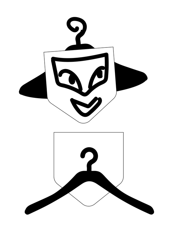
Above are some really rough ideas for logo. I this would probably have developed into some sort of flying robot using hangers or something with a moustache.
|
Idea 3: An app that allows the user to connect their own phone to a friend’s phone connected to the main speaker/sound system through bluetooth. This app is useful in cases where the main source of music with a set playlist at a party doesn't have a particular song or somebody wants to show a sound they have on their own phone, without the need of having to connect their own phones to the speaker. The main phone will act as a middle man and doesn't need to have the song in their iTunes for it to play, the playlist will be interrupted temporarily by the extra phone once the song is done the playlist will resume.
Names: Jam Splash, guest of honour, Tune Crasher, Playlist Crashers
Similar app:
AMPme: What inspired the idea?
-Martin-Luc Archambault wanted to listen to music as a friend’s house house warming party. He speakers were still packed so he put his phone on a table,but the sound was bad.
-Before people would blast their car speakers or perform something but now they prefer to rely on their phone’s weak speakers. Which led to him thinking we already have speakers in ur pockets why buy a bluetooth one. “Wouldn’t it be nice if we could all sync our phones perfectly to create a giant speaker?”
http://www.wired.com/2015/09/turn-handful-phones-speaker-system-app/
Draft Logo Idea:
How it might work?
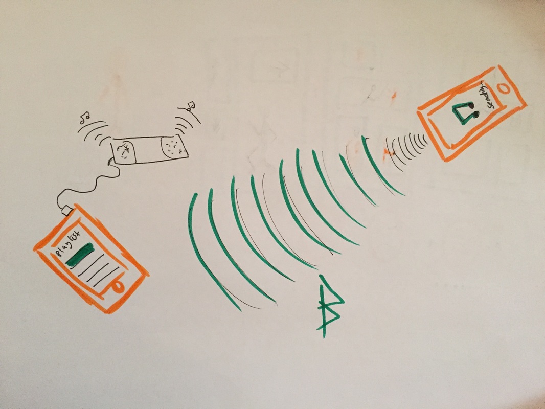
This sketch is showing how one iPhone is transmitting an additional song to the main phone connected to the speaker.
CHOSEN Idea 4: An app that prevents procrastination and distraction. The user is able to place a block on all the apps and notifications and set a particular time period for them to remain blocked. The app also allows apps/functions to be partially blocked so messages/emails/calls may be blocked with the exception of some important contacts e.g Mom, Boss. Once the time is up the app will text you the access code to reopen the app. This will prevent the app failing to meet its purpose since the user cannot simply type in the code whenever. In cases where the user changes their mind a backup account can be set such as text mom.
Names: Focus,That’s NoNo,Strict,Start2Finish(Taken),ISeeU(Taken), EyeOnU(Taken).Mode names:
Easy Going, Carefree, SOS, Sleep
Focused, Absorbed, Determined,
Awaken, Conscious, Alert, postpone
Possible other feature names: Work Frenzy, Time boxing
Possible Evil Character Names: Can do, Yup Yup, Leave it Leave it
