
Summary of project
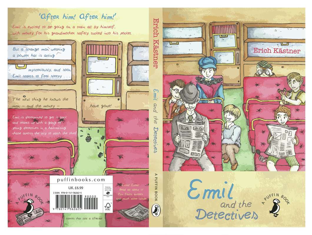
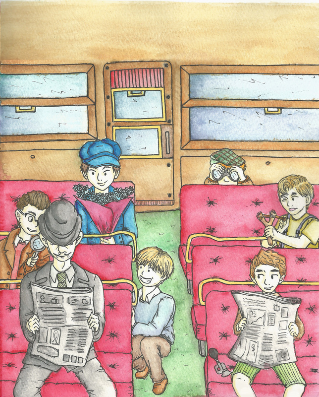
When creating this book cover I wanted to visualise the important aspects of the story and highlight the key elements which are Emil and his main friends, his blue jacket Sunday outfit, the train and the suspect. But most importantly I wanted to capture the fun of the story and the sense of adventure without giving too much away. Which led me to creating a pretend scene that doesn't actually happen in the book, but still encompasses the main plot, which is Emil and his friends spying and following this suspicious man with a moustache.
Final after development
Previously the copy at the back of the book was messy and all over the place, making it hard to read. So this time instead of putting the text where it fit and adding colour to contrast with the background the text was in, I decided to change the colour to represent a change in information.
'After after! After him!' is not really talking about the story like the copy underneath it so its a different tone from the synopsis, its more to catch attention. The synopsis is a darker shade of blue so that it shows up better against the dark brownish yellow background.
Extra Extra... is a different colour. I chose red to show excitement since its games and puzzles.
Grey was used for 'stories that last a life time' to show age. The other bright colours may fade but the story's excitement continues.
In order to make the synopsis stand out more I decide to add an extra layer with the ripped note page. The note page is still relevant to the story in terms of it showing how information is distributed through secret messages.
I also changed the positioning and scale of the background image in order for it to be in line with the sofas on the front page to show continuity and communicate better that both places or the same.
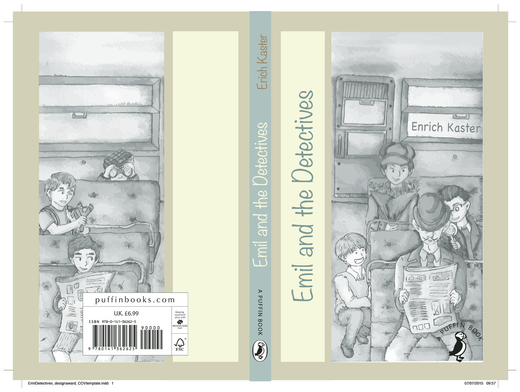
NOTICE: The one I submitted was the number 1 which is missing some information but I only realised after that I printed the wrong one.
'After after! After him!' is not really talking about the story like the copy underneath it so its a different tone from the synopsis, its more to catch attention. The synopsis is a darker shade of blue so that it shows up better against the dark brownish yellow background.
Extra Extra... is a different colour. I chose red to show excitement since its games and puzzles.
Grey was used for 'stories that last a life time' to show age. The other bright colours may fade but the story's excitement continues.
In order to make the synopsis stand out more I decide to add an extra layer with the ripped note page. The note page is still relevant to the story in terms of it showing how information is distributed through secret messages.
I also changed the positioning and scale of the background image in order for it to be in line with the sofas on the front page to show continuity and communicate better that both places or the same.
NOTICE: The one I submitted was the number 1 which is missing some information but I only realised after that I printed the wrong one.
First version of final
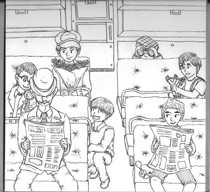
Making process
Alternative Versions
Initial Idea for cover
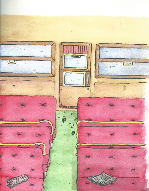
My watercolor paintings
|
|
Textures i created to use as background


Images for referece when drawing
Book Covers for reference
|
EXISTING EMIL BOOK COVERS
|
OTHER BOOK COVER
|
|
|
|
