
Week 1: Introduction to the course
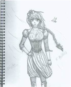 The manga drawing I did in May
23/09/2014 - Response to course introduction
Today I was introduced to the different things that would be involved in the first term of this course. Which includes an interesting way of developing and bringing a character to life. Next week I will be required to create a character with who I will live and interact with for a week as if it was real. At first I found it amusing but I think it will be an interesting experience and will help me understand what kind of image i want it to have.
Something that really caught my attention was that I would be able to materialise narratives not only through animation and film, but also through the use of graphic novel or comic books which is something I am really interested in since drawing manga is one of my hobbies. I have tried to incorporate this drawing style in year 1 for the Graphic Design Principles course, but I found that it didn't really suit the work I was doing and that it would require a lot of time to complete, so I only added manga to the cover and chapter pages.
Another thing that I will be required to do is carry a record of my work which includes my reflection on the process from start to finish. I decided to record this in form of a blog since I already have experience with this as I had one for my A level Media Studies class and for some of my year 1 courses. By using this method it makes referencing a lot easier and also allows me to embed multimedia such as videos and audio flies. However I will also include scans from my sketch such as drawings that are relevant to what I will be talking about.
Things to improve regarding my reflection and documentation medium:
- Documenting through images the whole process. Sometimes I would forget to take photos of certain steps or even important ones.
- Give more attention to trial and errors. Previously I only look into them briefly and sometime even forgot about them.
WEEK 2: CHARACTER MAKING WORKSHOP
30/10/14 - Creating the Prototype of My Character
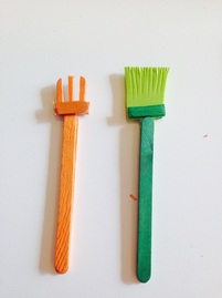
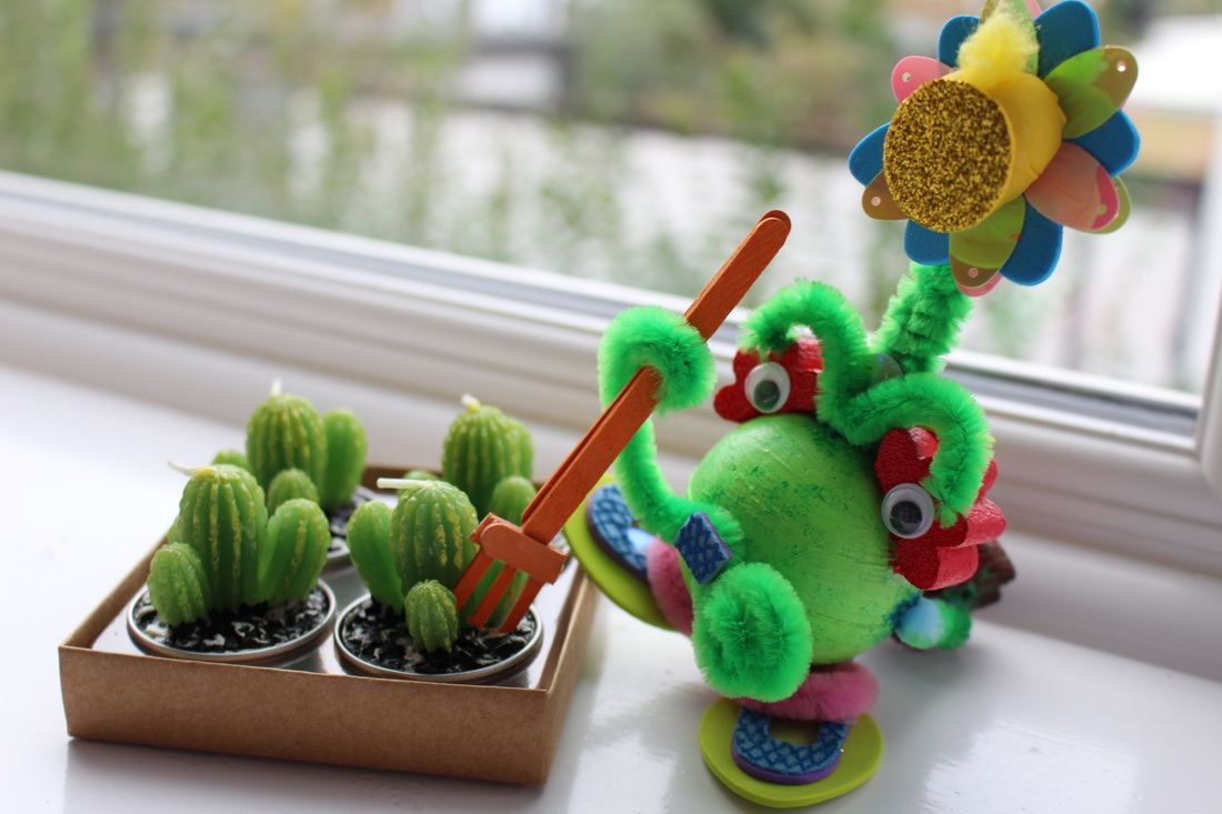
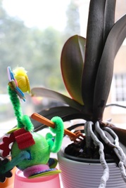
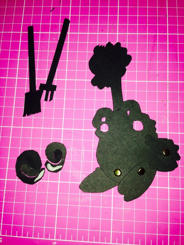
My Character's Favourite objects - Gardening tools
|
|
Today I was given the task of creating my own character for me to animate later own. But I had to create him/her through experimenting and playing with the materials I had brought with me rather than planning and designing on paper before had. I found that this method was really fun and useful because it made me think outside the box and go with the flow rather than be constricted by what I had already decided on paper previously. In a way this method was a lot quicker and allowed my creativity to flow smoothly, I began putting pieces together randomly that ended up looking good together, so in away my character came to life on its own.
During the making process my tutor asked me questions that made me think even more outside the box answering by instinct without thinking too much, the answer came naturally, and allowed me to become more aware of what this character in front of me was about and what he/she was like.
Some of the questions were:
Where does it live?
Does it have a hobby?
Does it eat how?
What kind of sound does it make?
How does it walk?
etc.....
Answering this questions helped give me a clearer image of my character and it was then that I decided that my character was a male alien from out of space who ate through photosynthesis and lived in a garden, which led me to make he's two favourite objects which are both gardening tools.
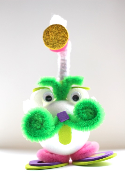
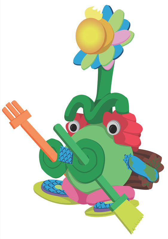
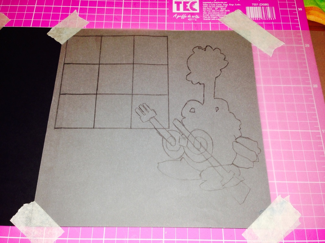
04/10/14 - Creating My Second and Final Peastache Model
Below is the process I through today when creating the new and final version of my character.
|
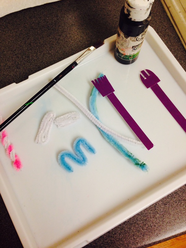
1) When colouring the petals/hair of my character I came across some minor setbacks, the foam I had initially intended to use for the petals, dissolved when in contact with the pink acrylic paint I wanted to cover it with.
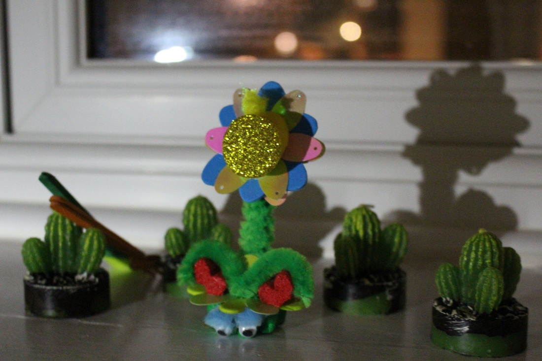
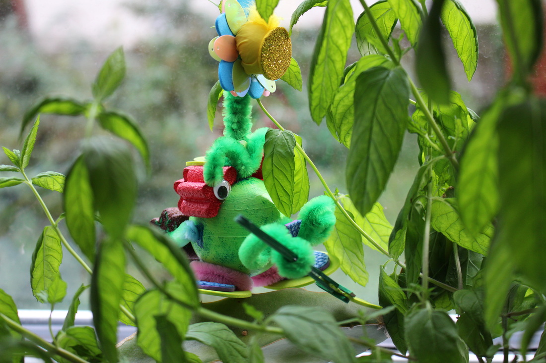
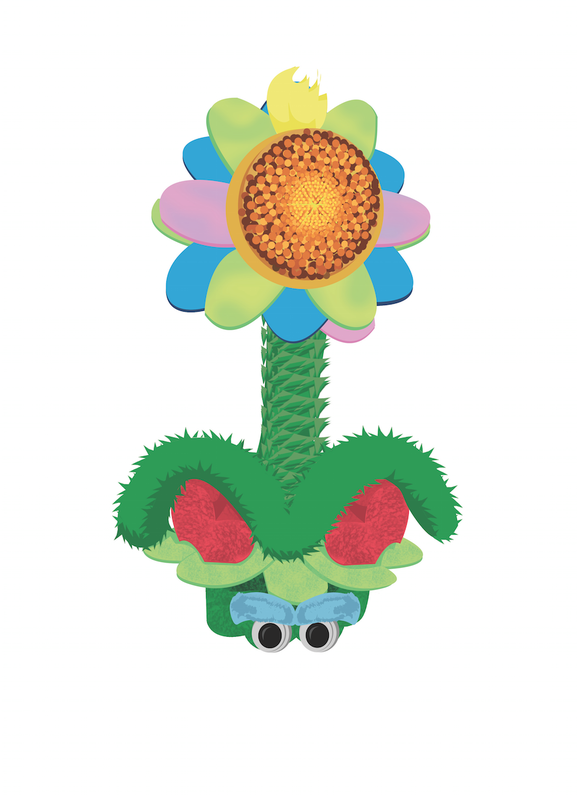
One method I tried to fix this with was covering the entire foam with masking tape, however despite this preventing the foam from dissolving it did not provide the desired surface texture for the petal. The second method I tried was to cover the whole foam with an old hot pink nail varnish I had, this method did indeed work on my tester, but once I tried to add the paint on top of the dried nail varnish a 2nd and 3rd time the foam shrivelled slightly which ruined the form of the foam. After doing this I realised too late that it would have been better to leave the foam with only the layer of nail varnish however I no longer had anymore left so I had to find another solution. 3) The next part was colouring the main section of my character, the foam ball. I decided to make it green in order to incorporate the fact that it needs to photosynthesis and help it to camouflage in its environment.
Once the light green layer had dried I decided to add some blue patches in hidden areas such as the top, bottom and a little on both sides. These blue patches would represent its original colour and enhance the fact that this creature was originally from outer space but changed colour after adapting to life on Earth. When painting the blue I decided to make it bumpy rather than smooth to add texture and allow the second later of detail, made with darker blue, to stand out more as scales. After the scales had dried I took a dry brush dipped it into dark green and removed the excess paint before dabbing it onto the whole surface of the foam ball. I did this in order to make my character seem more fluffy rather than smooth. Once the painting part was done I made three holes on top of three blue scales, the top and the two sides. Then I added the main part of the antenna to the top and left the holes at the side empty until it was time to add the pipe clears where the tree trunk would be held. 5) After making the feet I decided to work on the design of the antenna and change it from just being a round light, similar to the Anglerfish, into an actual flower.
I came to this decision after thinking about if my character would be able to camouflage itself if it just had a round light that looked too alien for its environment, the answer was not really. So I decided to change it into the shape of a flower which not only allowed it to blend with its environment but also incorporated this idea of my character having to photosynthesis, since flowers move in the direction of the sun, and my character needs sun light to survive. The stem of the antenna was also changed colour from white to green so for the same reason and to also match with the rest of the body. The eyebrows are placed at the end of the stem. 7) Finally it was time to create the most important part of my character identity, he's signature moustache which also acts as his arms.
The colour remained the same the only difference was that a layer of blue felt was added on top of the purple nose where a dark blue scale pattern was made with paint. I also added the three pink flowers onto the top of the head (made an extra one for the back of the head) to act as the hair and the eyes of my character. Above the hair three leafs were added but before gluing them I removed the antenna to make sure that the leafs would not block the passage since the antenna is supposed to be able be removed whenever needed. |
2) After my initial difficulties with the first type of foam I decided to try out another type, but before using it I tested if it melted when in contact with water to prevent wasting resources and time. After making sure it didn't I checked to see if the shape of this new foam suited my character are not. This led to the first change in appearance of my character, the new foam caused the hair to go from being single petals to whole flowers which still worked well with the placement.
The new shape also gave me the idea to add another section to my character which was inspired by farming trucks which would also help balance my character. To do both of these parts I cut a piece of foam into 2 parts 2/5 and 3/5, the 3/5 section was cut in half and painted pink for the hair/flower and the 3/5 section was painted brown and green vines were added for detail to make it look more organic, like a tree trunk and move away from the machine aspect of the truck inspiration. Truck reference: http://www.stackyard.com/news/2013/07 /machinery/case_combine.jpg 4) When making the feet, the structure remained pretty much the same apart from a few details that were added.
The base stayed the same shape and colour. However the purple arch gained an additional thin blue layer of felt to maintain blue scales detail consistent, details were added onto with dark blue like I did for the foam ball. The arch also changed shape but only slightly since I had already used both of my Us when making the first draft of my character, so I had to cut the shape out of the letter P instead. All of the parts were glued using UHU except for the purple arch which already had a sticky side. 6) Now that the flower antenna, feet and tree trunk were finished it was time to add them to the green foam ball.
The Feet were glued using double sided table onto the bottom of the ball, and the antenna was placed onto the hole I made at the top of the ball. When it came to adding the tree trunk at the back I had to first place a blue pipe cleaner into the hole in the centre of the foam tree trunk. Then I dabbed some dark green paint onto the parts that where close to the edges of the tree trunk and some dark blue to the tips that would be placed inside the holes on both sides of the foam ball. These tints of blue and green were added to allow the blue pipe cleaner to appear more part of the creature, the blue made it seem like scale were growing from the ball to the pipe and the green made it look as if the vines were climbing up from the tree trunk to the pipe cleaner. 8) After finishing the big day version of my character I went on to building the smaller night version.
The night version of my character is smaller because he decreases in size to conserve energy at night while receiving energy from the moon light, during the day he grows big again because he is now fully charged. The base is made using 2/5 of the original shape of the foam which I painted green to represent the character's green body. At the top I added the leafs which look similar to those added on the top of the big version's hair. The pink hair is also present on the smaller version however it is made using only one half (the size of one hair flower) which is then cut into two. The eyes as placed at the side where the blue eyebrows become the signature feature of the creature instead of the moustache. I made them blue rather than green because it was the only place where blue looked the most natural, and blue needed to be present since it references the alien side of my character. |
After completing my character I was able to finally give him a name, "Peastache" which is a combination of Peas with Moustache. I chose to combine these words because he is mostly made up of a green ball and his most distinctive feature is his moustache.
Peastache Character Profile:
05/10/14 Peastache Photoshoot
|
|
|
|
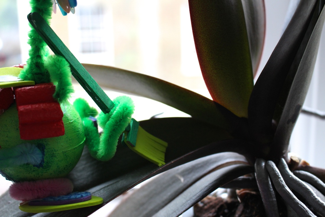
Today I decided to photograph both of my characters, the first draft and the final model, in order to allow the main differences between them to stand out more as well as give attention to all of the different details.
I tried to take photos from different angles that might or might not be seen in my animation later in order to check how my character might come out on film.
This images also allows for some comparisons to be made between the two models and test them against Peastache's character profile or specification.
Peastache facts and how they are met:
Is an alien but has adapted to earth: Other than it form the first version doesn't explore this further, unlike the final version where scales have also been incorporated in some areas to show that Peastache is still in the process of adapting through evolution.
Feeds through photosynthesis: The best colour to show this is green because of chlorophyll, in this case the final version would be most suited since it contains more green parts. The flower for the antenna is also more suitable.
Lives in a garden: For a creature that is not from Earth the ability to camouflage into its environment is very important. Peastache lives in an area where most things are green and there is hardly any white so the first draft would have a hard time blending in.
Stands upright and walks on two legs: The first draft had difficulties standing up without falling over so adding the tree trunk at the back made Peastache able to stand on his own for a long time without me holding him or putting him against something.
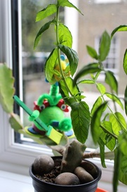
Living for one week with my character
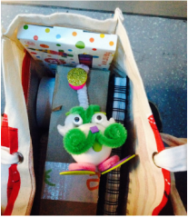
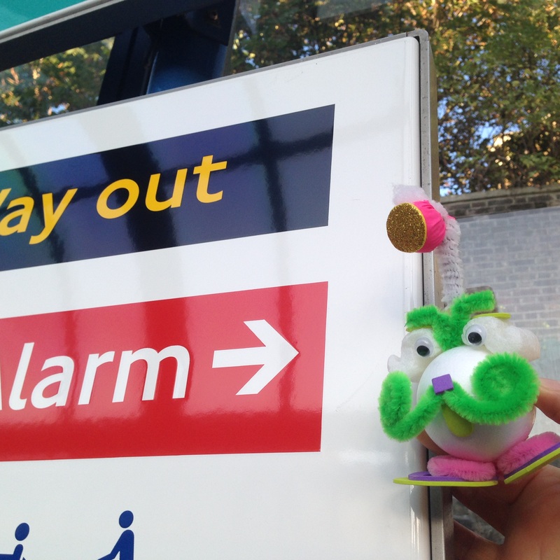
1) On his first trip to the outside world Peastache asked if he could have a better view since he couldn't see much from inside the bag.
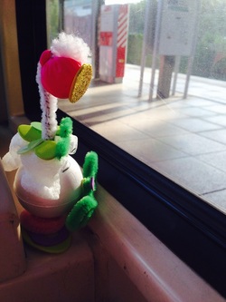
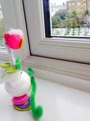
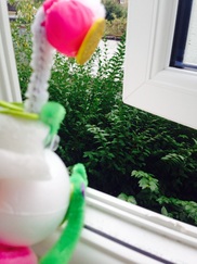
4) Finally he reached the window the place where he could have the best view of what was happening outside and he stayed there throughout the whole journey.
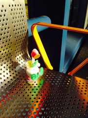
7) After I took the photos he sat on a chair to wait for our next train where he observed the world without blinking.
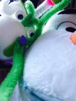
12) As he walked around my house he was really happy to come across my Olaf doll. His a big fan of Olaf since he loves snowman's - they remind him of his home planet. He even took a selfie with him, I think he thought Olaf was the real thing.
15) When night came his turn into his smaller self. I placed him where he could have a good amount of moon light shine on him so that he could be fully charged for his surprise tomorrow.
18) ...to the other and from one plant....
21) The rocks were also cared for,
|
2) So I placed he on the seat between me and my friend, however his curiosity still wasn't satisfied.
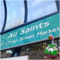
5) When he arrived at one of our stop he kept asking me to take picture of signs...
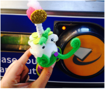
8) Once we arrived at our destination he found the oyster tap in machine really interesting because of the peep it made, he even tried to see if his moustache made it work as well.
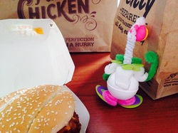
10) From the station we stopped at KFC for some lunch where Peastache was unable to look at the burger because of all the living things that had been used to make it. He is very sensitive when it comes to harming the environment -_-.
13) Throughout the day I noticed that Peastache spent a lot of time starring out of the window. He was feeling kind of down I could tell by the fact that his moustache was uncurled.
16) Today I woke up to find that my character had evolved into a green Peastache. Additionally he was really happy with my surprise for him, I brought some plants for him to practise his framing skills with.
19) To another.
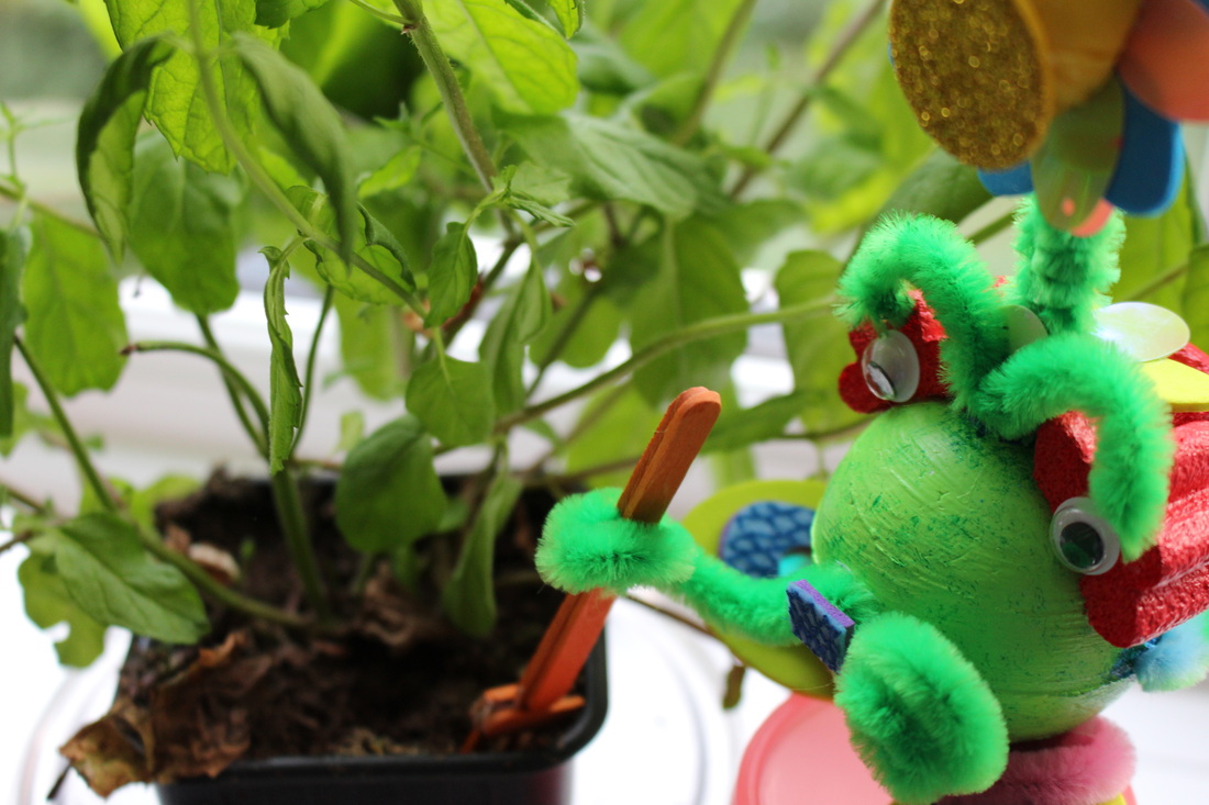
22) and so was the soil, nothing was overlooked.
|
3) Slowly he began he climb higher and higher and the more he saw of the outside world the more he wanted to see.
6) ....and more signs..... after all everything was new for him. I wonder if they don't have them in his planet
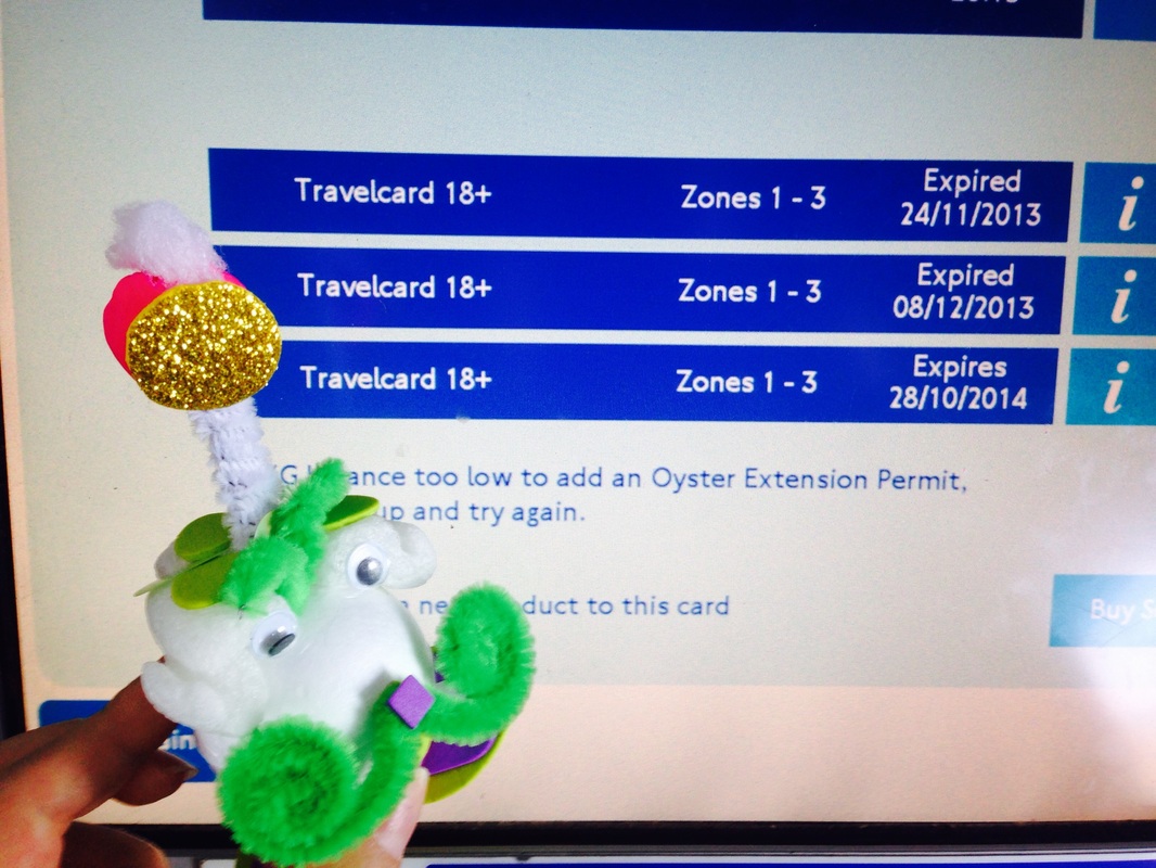
9) He also offered to help me top up my oyster despite not knowing what that was, which was really nice of him...... I think he thought it was an actual oyster, he loves nature after all .
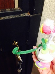
11) Then we went home. Once we got there he once again offered to help me by opening the front door.
14) So I decided to open it for him. He felt better straight away being able to breathe in some fresh air and feel closer to plants was good for him.
17) He went from one leaf......
20) He showed care for every individual leaf and detail of each plant.
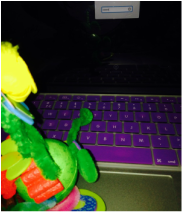
23) Once he was done we spent sometime together watching videos on Youtube. He once again offered his help and typed in my password for me.
|
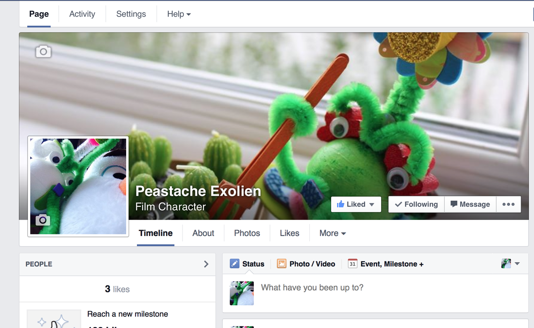
Peastache's Facebook
Week 3: Forming groups + Presentation of character
07/10/14 The Presentation and suggested improvements:
Today I presented my character, Peastache to the class and shared with them the things that we did together during the week. In regards to this I was told to make the narrative of what happened in the week clearer and since I could do this in any format I decided to add captions to the photographs and place them in a better order (previously they were randomly arrange with no explanation).
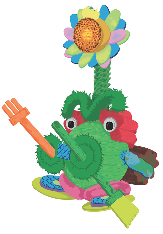
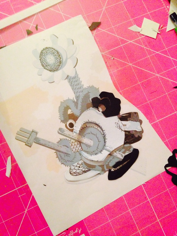
In my presentation I also showed the 2D coloured version I made for my character, despite receiving positive feedback, I was advised to add more detail in order to it resemble the original 3D model more, and added more petals to the flower so that it looked more like a flower.
Today I presented my character, Peastache to the class and shared with them the things that we did together during the week. In regards to this I was told to make the narrative of what happened in the week clearer and since I could do this in any format I decided to add captions to the photographs and place them in a better order (previously they were randomly arrange with no explanation).
In my presentation I also showed the 2D coloured version I made for my character, despite receiving positive feedback, I was advised to add more detail in order to it resemble the original 3D model more, and added more petals to the flower so that it looked more like a flower.
|
|
The above images shows some of the making stages of the initial colour 2D version.
I also made a 2D version of how Peastache looks while he sleeps.
I decided to make this one as well because I realised that my character wouldn't be complete without it since he changes form depending on the time of day. So far I don't know whether I will be doing a 2D or 3D animation so its good to have a version of my character in both formats and knowing what he looks like in both versions will also help me make a decision. |
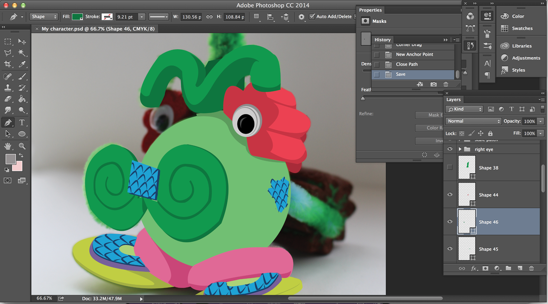
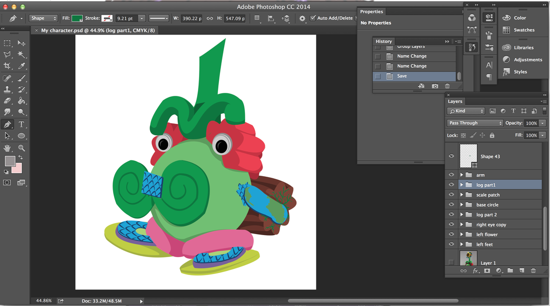
Both versions of my 2D models were made mainly using the shape tool, pen tool and warp transform effect, using a photograph as guidance.
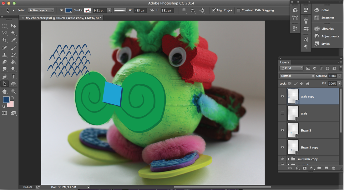
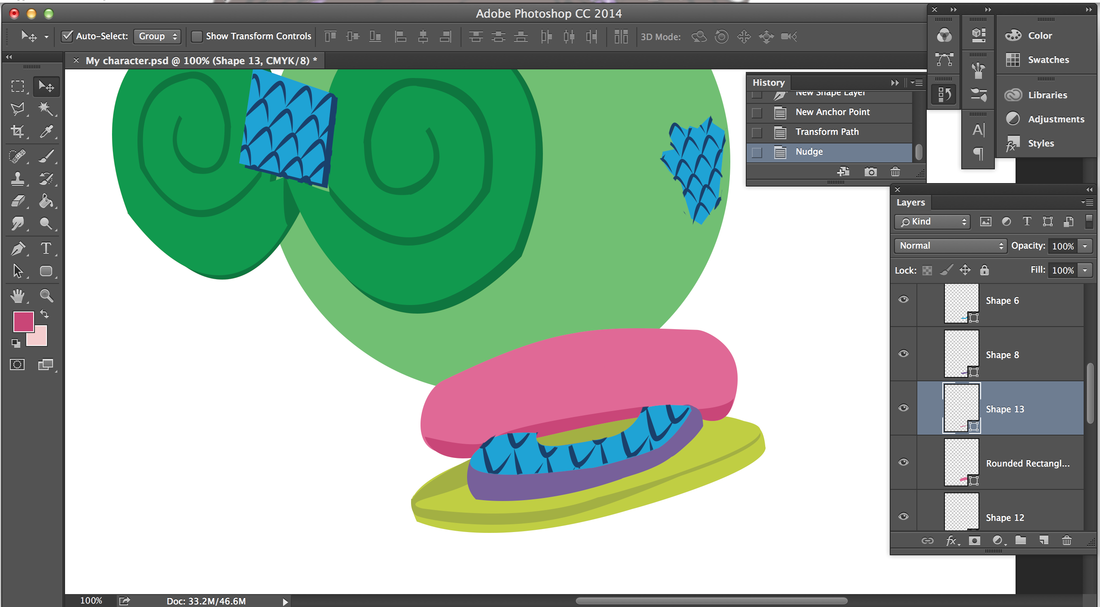
The first 2D Peastache I made looked rather flat, it failed to incorporate all of the different textures present on the original 3D model. The only indication of texture was the grandaunt effect on the flower which gave a hint of light flashing from it and the blue scales drawn using the pen tool, apart from this the rest of the model appeared to have the same texture. So after receiving the feedback from my presentation I went back onto photoshop to add the other textures. Some of the textures were created by selecting parts of the original photograph and then filling in the selected area on my 2D model, an example of this is the fluffy pink design on the feet. I also used this method with the gardening tools which were made of wood, I also burrowed this texture to use on the tree trunk at the back since the original material for it was foam and wouldn't produce a result as realistic. To create the hair I used a different method. First I drew a few spike strands using the pen tool and then I just kept copying and transforming it to fit in different areas and work for different angles. This copying and pasting method was also used for the centre of the flower in order to allow it to resemble the original material more than was possible with just the gradient effect. The effect on the petals was done by painting onto with a harmonious colour and then rubbing out the edges with a feathered brush. This allowed the surface to look slightly metallic and seem as if it changes cooer depending on the angle. |
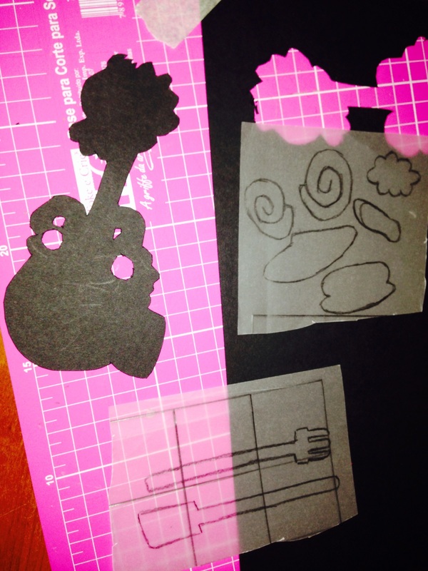
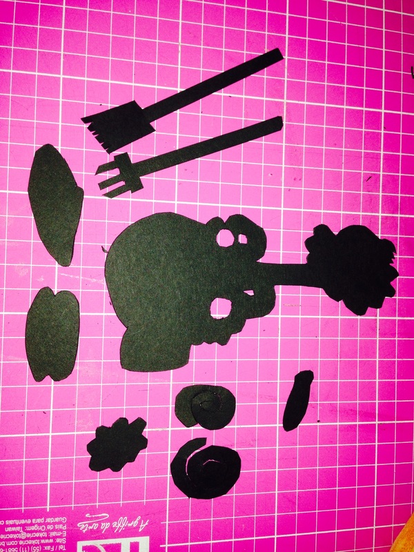
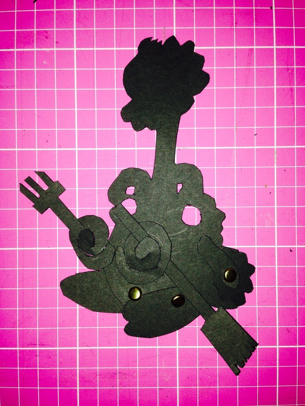
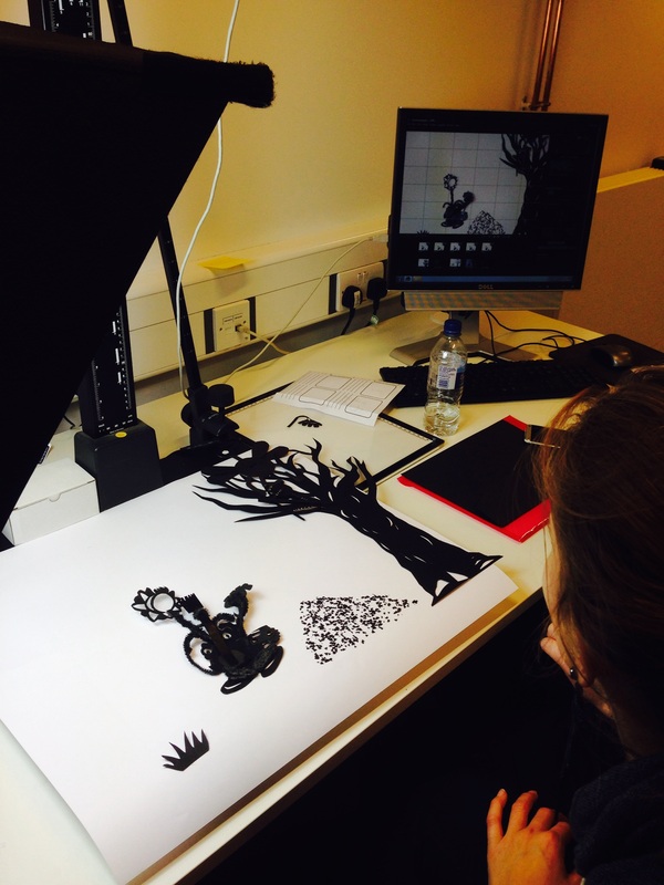
Creating My Character's 2D Silhouette
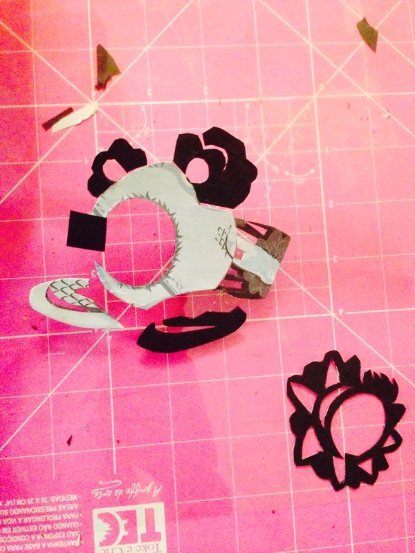
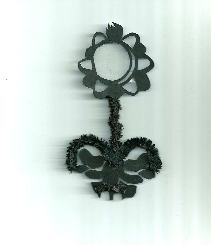
Another thing I presented to the class was my first attempt at making a 2D silhouette of Peastache.
|
This was my attempt, the materials used were black card and split pins.
The feedback I got from presenting this was that a lot of the detail and texture of my character was lost, especially the moustache, it didn't stand out and wasn't able to move much. I also thought the same and from the experience of making and carrying it I found that the material wasn't really durable and could be easily bent and crushed. |
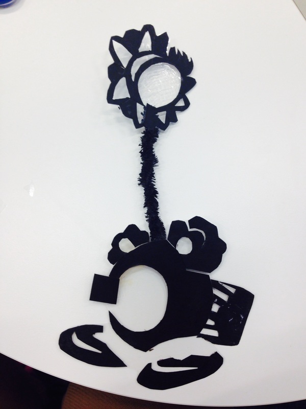
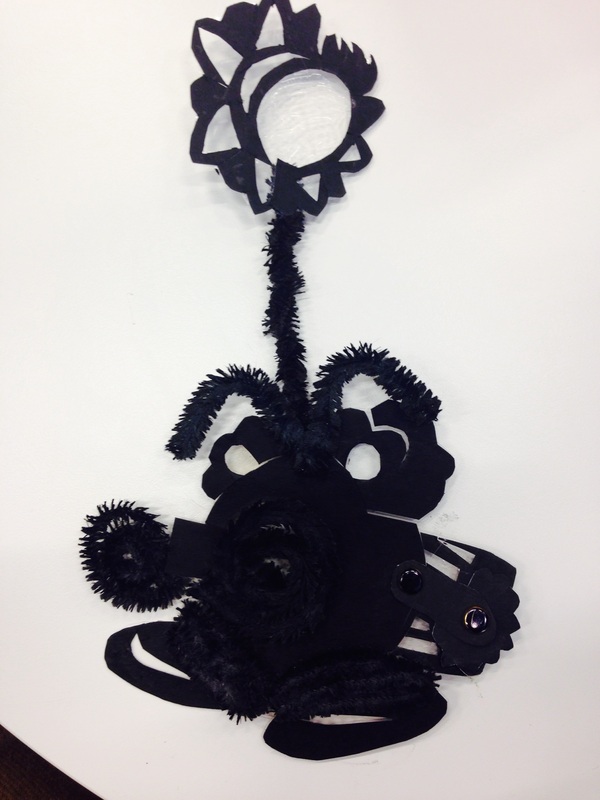
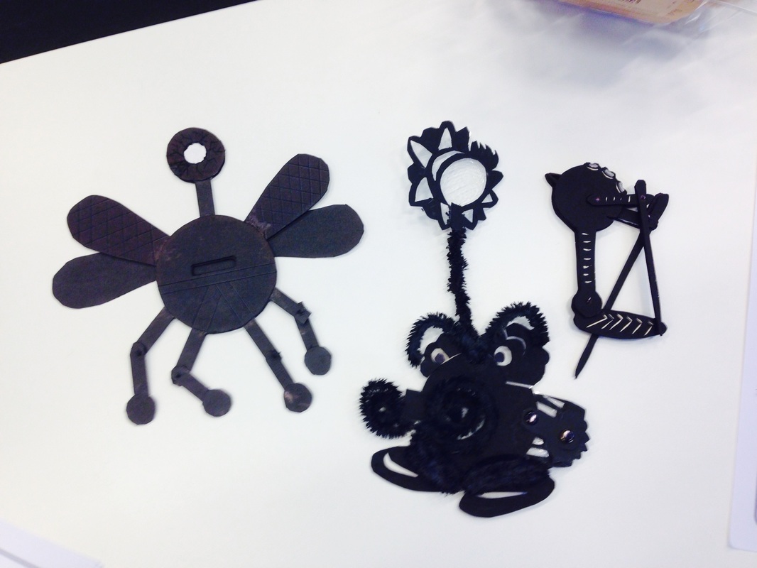
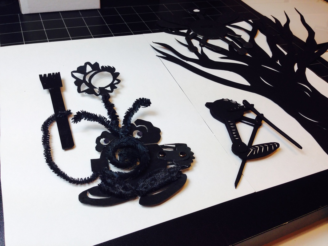
When making my second and final silhouette I decided to glue the black card above a sheet of clear acetate this would allow the silhouette to be firmer and for the moustache to be seen clearly. But first I had to make sure that I left a blank circular space underneath the area where the right moustache would go so that some of the acetate and background colour could be seen when the moustache was curled up, consequently this would allow the background to act as an outline of the moustache.
The acetate would also provide an area where the pupils can be placed and moved around without damaging the background paper used in the animation. Another change I made compared to the first one was that I used actual pipe cleaners for the areas where pipe cleaners are used on the original 3D model. This would allow my character to move around more freely and consequently behave more similarly to the 3D version. |
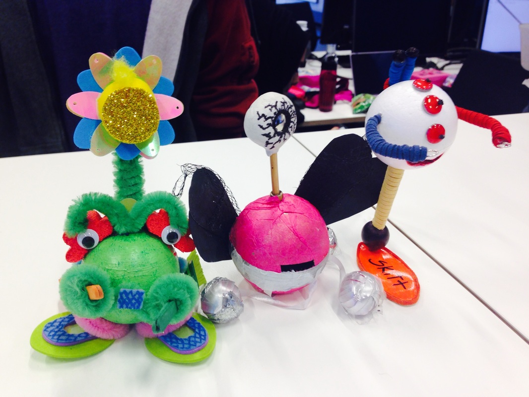
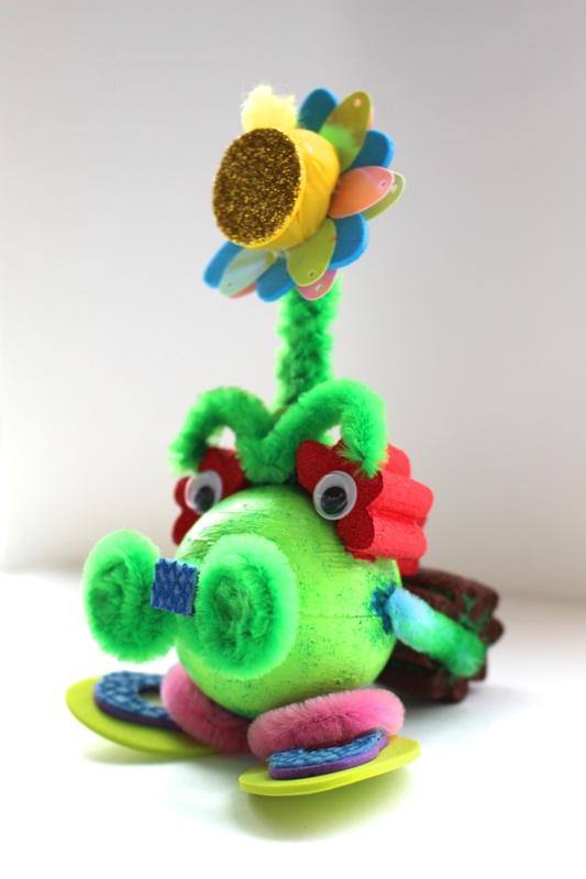
My Animation Group Characters
When the presentations had finally finished, we were placed into groups according to which characters fitted well together. The group me and Peastache was placed in included Jolie (centre) and Skitt (right)
Overall I was really happy with the group I was placed in, I think the characters go really well together, they look as if they all belong to the same species because of how they are all made up of a ball. The combination of colours also work well together, the others aren't as colourful as Peastache which will allow the animation to be more user-friendly in terms of not being overly bright and colourful which can be overwhelming. Another point is that despite the similar shape each character has their own uniques characteristics which allow them to shine individually as well as in a group.
Additionally, as well as the aesthetics the personalities of the three characters work well together, Skitt is active and mischievous and likes playing in the snow, while Peastache doesn't like snow in his garden and Jolie also likes nature . So there are a lot of fun possibilities for stories.
week 4: My teams' 2d animation
The story: Peastache cleans up an area of the snow filled garden to plant a flower. Meanwhile Jolie and Skitt are on top of a tree and see the whole thing, but what they have their eyes on is the big fun mountain of snow Peastache has built. After Peastache plants his flower he walks away. Jolie uses that opportunity to fly Skitt over to the mountain where she releases him, and Skitt slides down creating a splash and consequently bends the freshly planted flower. Peastache comes running over while waving his gardening tool in the air Skitt slides away and is picked up by Jolie who also blows the tool out of Peastache's hand with the wind created by her wings. The both fly away and Peastache sadly picks up his flower and takes it away.
The Initial Storyboard For Our Animation
|
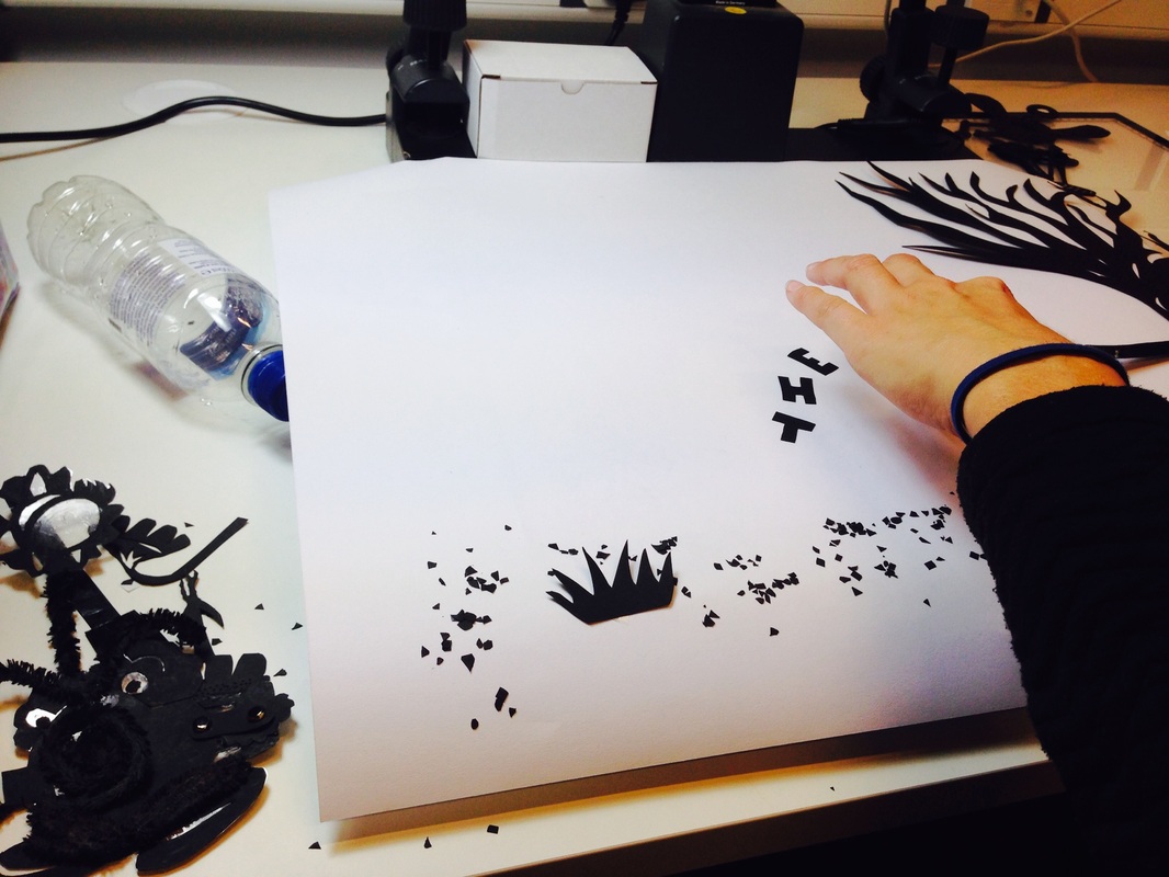
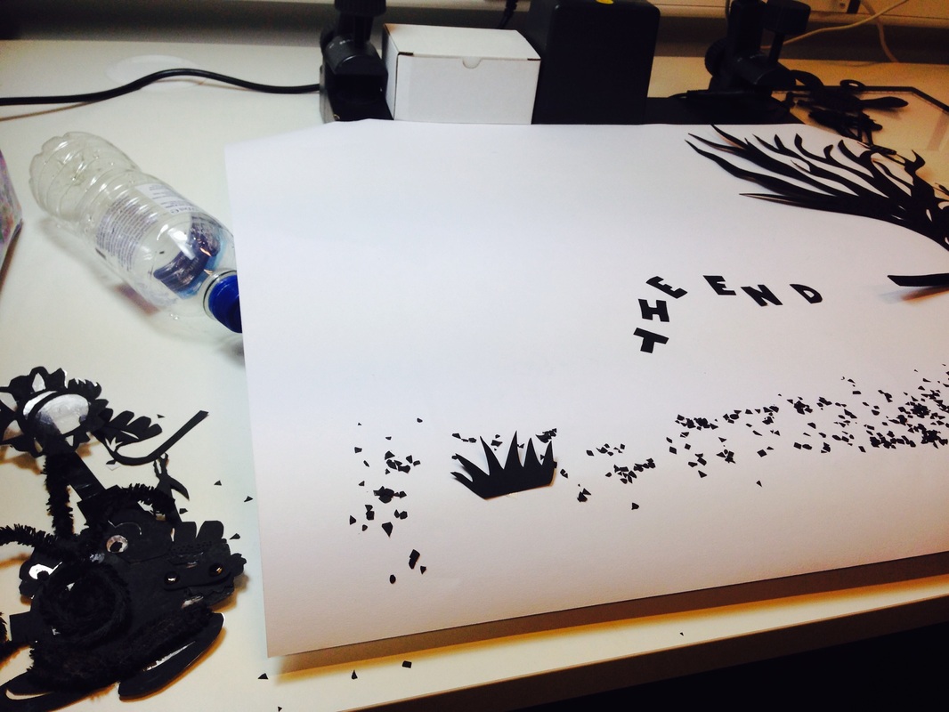
14/10/14 - Creating our 2D silhouette animation
Today my group stayed after class for two hours to complete our 2D animation in the first attempt. We were lucky to have access to the correct equipment and support from the technician which allowed us to finish the animation faster than expected. Despite the fact that we needed to be really careful, calm and aware of every movement we made our characters do, which was tiring, it was worth it since it was really fun and interesting to see my character come to life on screen. I also didn't realise how expressive my character could be just by using its moustache and eyebrows instead of sounds and words. |
|
Final Storyboard For Our Animation
Initial ideas for final
|
My groups' first initial idea for the medium in which our narrative would be told, is in the form of a pop up book.
The pop up book would not have such complicated paper engineering like Peter Dahmen's work since he focuses on the movement that shapes make rather than what they are. http://designtaxi.com/news/370517/Wonderful-Pop-Up-Cards-Unfold-To-Reveal-Gorgeous-Intricate-Papercut-Designs/?interstital_shown=1 Instead our book would be designed like a children's pop-up book. The objects and characters would pop out onto the landscape created when flipping the pages. The paper engineering will not be basic and simple, we would use the most efficient and appropriate method for creating the different elements, but we would try to avoid really complex methods since none of us have any previous experience with making pop up books, so it would require a lot of time for trial and error in order for it to be made. http://www.thefwa.com/library/fwa2-2RX9.jpg |
|
The other I idea we had was to create our backgrounds using fabric in order to move away from the black and white nature of our initial experiment.
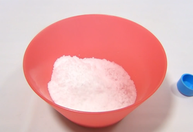
We liked the idea of recreating landscapes for our animation with fabric because of the variety of textures that different stitches and fabrics can create. This would make our backgrounds appear more interesting. For the snow we thought about using insta-snow which is a powder that creates fake snow when mixed with water without melting and felling watery. https://www.youtube.com/watch?v=OlAo05cZCS8 |
|
|
Another idea we had was to create the backgrounds using skittles since one of our characters, Skitt, loves skittles a lot so it would be relevant material to use.
We got this idea from watching the above music video. I really like the transitions from one background to the other and how they are created by slowly and almost unnoticeably adding a different colour jelly bean which piles up into a new image. My favourite transition was when the singer fell into a pool of jelly bean and her image dispersed because she was replaced with a jelly bean version of herself. This part was really well done and the transition flowed well because it successfully recreated the movement of water ripples, making it seem as if she really had fallen into water. I also like how different objects and creatures are created within those background and still maintain their natural movements and allow the background to maintain its original formation, For example the fireworks. Another thing I like about this method is how the singer interacts with the background helping it change by manipulating the jelly beans. The jelly bean texture was really well used as well, noticeably in the cave shot, where the black jelly beans shine in the light to show that its humid. |
The fourth idea we had was to draw everything onto a piece of thick card, colour in the drawings and cut them out individually. While still incorporating some small details that would be drawn bit by bit onto the surface when filming the animation.
This idea was very similar to how the above animation was done. I really like the aesthetic look of it, since it looks as if a children's book has come to life. The water colour also makes it appear more delicate,soft and cute.
This idea was very similar to how the above animation was done. I really like the aesthetic look of it, since it looks as if a children's book has come to life. The water colour also makes it appear more delicate,soft and cute.
|
|
Since we might also be using After Effects we found an additional animation (on the left) where the same traditional method is combined with digital technology. The main elements such as the characters and some props remain hand drawn but are given a 3d style movement despite being 2D drawings. The background and other props appear to be made digitally since their texture and aesthetics are different from the hand drawn, for example the don't have the signs of scribbling and lines made when colouring.
https://www.youtube.com/watch?v=Gdbqw0dcdSQ |
WEEK 5: Animation references:
This is a music video that uses animation in an interesting way. Its in Korean so I included a version with English Subtitles, in order my my reasons for liking the animation to be more clear as well as the meaning of the imagery.
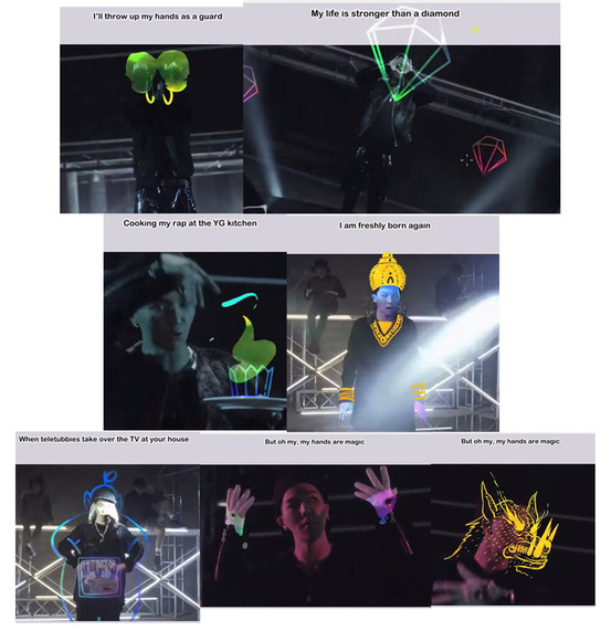
What I like about the video is how the animation used reflect directly or symbolically what the lyrics are saying. This allows the singer to interact with the animations through body movement and manipulating their movement on the screen without actually using real life objects, which kind of reminds me of weather forecasting where the presenter doesn't see the animated clouds but still express them with body language.
Some examples of this are at:
0:41- "I'll throw my hands up as a guard" : In this part of the video the animation shows boxing gloves forming on his hands as he goes into a defensive position.
0:44- "My life is stronger than a diamond": Diamonds appear and sparkle around the screen, mirroring the content of the lyrics.
0:48-" Cooking my rap at the YG (company) kitchen": A cake is formed using his hand movements, as he twirls his hand the frosting builds up and when he clicks his fingers a cherry falls on the top. Which symbolizes the craft of music production.
1:42 -"I am freshly born again": In this part of the video the singer is dressed as Krishna using the animation that is superimposed on top of him. This gives reference to the concept of reincarnation and to the lyrics " born again"
1:46 "When Teletubbies take over the TV at your home" Here The singer forms a TV with his hands and brings it to his stomach area completing the Teletubbies outline animated around him.
2:02-2:03 "My hands are magic"In this section of the video, His hands are covered with a colorful liquid to symbolize magic and that is further explored when he waves his hands across his face to reveal a beast's face on top of his own indicating that the magic has transformed him, which is all done using animation.
There are over examples throughout the video such as an animated chain around his neck that rips when he pulls it off, a Pavarotti mustache is formed on his face when the name is mentioned, his skeleton appears ontop of his body to indicate being electrocuted etc.
What interested me about this music video is how its made to look as if the movements are made using stop-motion animation by creating movement (through changing the paper rip patterns) at the edges of the participants and singers. It goes really well with the theme of collage in the music video which can be seen in the background where different streets and buildings are composed together, but it is even more prevalent during the sections where different parts of women facial features are placed on top of each other.
This particular aspect of the video caught my attention and made me think that the medium which is paper is used to emphasise a statement about beauty which is explored in the song lyrics. The photographs and paper in this case might represent magazines and advertisements where an unrealistic vision of ideal beauty is reinforced and transmitted to the public. This music video using this method challenges that vision and begins to show the more realistic and natural beauty of women and explores the idea that beauty if subjective by having various women with individual charms feature in the video and uses their facial features to form the ideal beauty collage through stop motion, which shows that ideal beauty is fluid and not static to just one thing.
This particular aspect of the video caught my attention and made me think that the medium which is paper is used to emphasise a statement about beauty which is explored in the song lyrics. The photographs and paper in this case might represent magazines and advertisements where an unrealistic vision of ideal beauty is reinforced and transmitted to the public. This music video using this method challenges that vision and begins to show the more realistic and natural beauty of women and explores the idea that beauty if subjective by having various women with individual charms feature in the video and uses their facial features to form the ideal beauty collage through stop motion, which shows that ideal beauty is fluid and not static to just one thing.
This Brazilian juice really caught my attention for its choice of materials when making stop motion animation,
They thought outside the box, rather than actually using a realistic shark shaped toy, they created a shark shape using a pineapple in fact both main characters of the story were fruit which directly relates to the product the advert is about. I also really liked how they were able to recreate the movement a fish would make if they were trapped on sand with a pineapple while still looking natural like a fish's would be. But what caught my attention the most was the hurricane made from fabric, which not only incorporated the shape of a hurricane but also of liquid traveling up a straw which was what the whole mini animation was about.
The use of stop motion animation allowed the idea of fruit juice being drank through a straw a lot more interesting and creative.
The above animation was the one that really helped us solidify an idea and how to execute it. The movement of the character is still a bit stiff and shaky but it was the background and method that caught our attention. I really like how simply changing the lighting of the background can be so effective in portraying and distinguishing between night and day. The use of different layers of tissue paper of the same colour but in different tones also help to provide a flat surface with a sense of depth. The negative effect on the image to portray lightening flashes was also really effective wold looking like too much and going away from the original aesthetics of the animation.
Week 6: Filming 3D Characters in space
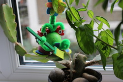
28/10/14 Today we met up before class to go to Abbey Wood in order to film our 3D character in space. We chose to film the clip in this location because of the large amount of greenery and nature present in my area, which is a common interest amongst all three of our characters.
During the filming process we were exploring the different ways that our 3D characters might interact with one another as well as the environment. We previously didn't have a chance to fully understand the movement they could make in 3D form since we had only worked with their 2D versions.
Finding out how they might hold onto each other was really fun and some happy accidents took place for example how Jolie held both Peastahce and Skitt and flew with them, we had no idea it would work, they just kind of stuck to her and ended up looking good and fun, so we found out that her ball shaped feet were a good form of her interacting with other things.
Similarly Peastache's moustache proved to be just as useful in 3D as they were in 2D and the character still remained heavily dependant on it to hold and hook onto things as well as climb walls.
Overall I think this was a good experience in terms of it providing us with a bigger understanding of how our character worked and moved. But the end result was a combination of trial and errors of how of characters might interact with the outside world and didn't really provide a clear narrative.
If we were to do this again we would use the knowledge we have gained from the experience and plan out exactly what we might do with out character in the space in order for the narrative to be clearer.
If we were to do this again we would use the knowledge we have gained from the experience and plan out exactly what we might do with out character in the space in order for the narrative to be clearer.
Week 6 & 7: After Effects Workshop
The video above shows the work I did in the After Effects tutorial workshop. The first clip is my own attempt at animating my character. I am not satisfied with it but the workshops allowed me to know what I did wrong, in this case the feet move too much, it should have just go up and down, each foot in opposite direction and the background should more rather than the character, if I did that it would have worked better, and the feet and character would be more in synch with each other.
The second video was the result of the first workshop, I had to add wings to a png character and animate them using the puppet tool, the character did not move, the movement would be expressed by sky and buildings in the background.
The third animation was made in the second workshop. This time I was taught how to use green screen and replace it with a background. This workshop was even more enjoyable then the first since the end resulted looked really professional as a result of the green screen dinosaur file we had available.
Overall these workshops were extremely useful I learned so much in just to lessons and my interest for animation grew. I had no experience with After effects before this so this sessions made me feel a lot more comfortable with the software which looked overwhelming at first.
Week 8: Presentation of initial ideas
The Story: Peastache checks his garden before going to sleep (there's like 4 flowers and in the shot u can see Jolie and Skitt hiding in a bush )
Once he's asleep Jolie and Skitt begin to build the snow making machine (a couple of shots showing the machine getting bigger with Jolie flying parts around and Skitt securing them in place)
When Peastache wakes up the whole garden is full of snow around 4 medium size hills so he is super shocked ,while Jolie and Skitt are shown playing and sliding and snowball fighting.
That night while the two are asleep thinking Pea is as well
Pea sneaks around and finds out the source of snow, determined to bring summer back or just to get his garden back he grabs his tool and puts it inside the pipe where the snow comes out from and goes to sleep
Suddenly they all hear an explosion which was caused by the pressure built in the pipe.
Startled they all go to check and find that it was the machine that exploded
Peastache sees how sad the other are it wasn't his intention to make it explode so they come to an agreement that he would build it again but only if they played on only one half of the garden, the agreement is sealed with a hand shake , Peastache builds the new machine and Jolie and skitt gift him with a new tool.
Initial Storyboard For Final Animation
11/11/14 Today me and my group presented our initial thoughts for our final animation.
The overall feedback we received was that the aesthetics of our presentation did not match well with our animation style and that despite the use of green which shows a connection with nature, we should avoid using already made templates and layouts, to make our presentation more personalised.
Another suggestion we were given was to rethink the length of the storyboard because it appeared to be quite long with a lot of shots that could be cut down and re adjusted into split screen etc, in order to decrease the length of the animation and make it fit into the maximum length allowed, which is around 1 minute 30 seconds.
Creating Additional Silhouettes
|
|
After completing the final storyboard we made a list of all of the additional silhouettes that needed to be made for our final animation as well as the necessary materials and separated them between ourselves.
The list was as follows:
The list was as follows:
|
Silhouettes
- 3 Flowers - 1 Bush - Peastache Sleeping Version - Snow Machine - Snow flakes |
Materials
-Green Tissue Paper -Blue Tissue Paper |
I was given the task of creating the snow machine since I was more familiar with what it was suppose to look like from drawing the storyboard. When designing the snow machine, rather than it looking like a real snow machine, I wanted it to fit the aesthetics of a cartoon and look more fantasy-like, which is why I made it look like an igloo.
I also made the the sleeping version of my character.
I also made the the sleeping version of my character.
|
26/11/14 Today we booked the animation studio from 11am- 5pm in order to film our animation.
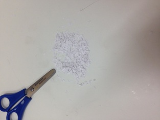
Each one of us was given a task, Garbriele needed to know how to use the stop motion program, Michaella had to bring the tissue paper and I had to direct and move the characters, the other helped move them as well when needed, since I was more familiar with the story. When arriving at the studio I had to find a light box which we would later use as the base for our animation. Luckily a brand new thinner light box had recently arrived at the uni which prevented the animation from looking to zoomed in because of the distance between the bad and the camera. I was also given the task of creating the snow which we decided should be made from white card instead of black since the black pieces used for our trial animation looked more like soil then snow. However when we added the small piece of white card we found that they were barely visible because of the background colours and lighting so we had to come up with an alternative quickly. Luckily this was resolved with the use of cotton for the snow which also provided a nice effect when placed against the light emitted from the light box. When filming our animation we did not stick strictly to the storyboard because as we were doing the animation as a group, better idea, appeared naturally such as the throwing of the snowball. This allowed the amount of shots found in the storyboard to naturally decrease. |
WEEK 11 : Final Presentation
01/12/14 Today I have finished editing the first full version of our final animation.
02/12/14 Today we present our final "A Snowy Summer" animation to the class.
For our power point presentation we tried to incorporate the feedback we had received in our previous presentation, and make it have a consistent style with our animation. We did this by making the background a screenshot of the scenery found in the animation and added black silhouettes of plants as a reference to our black card silhouettes and setting. We also used a chalkboard type of typeface for the title because of the texture it produces which resemble snow. (The powerpoint was made by Michaela but we discussed what it hold look like and contain as a group).
Week 12: Making changes to animation
|
|
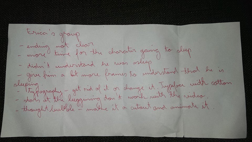
Using the feedback my group was given during the final presentation I began to make changes to our final animation.
The changes I made were to add close ups of Peastache sleeping as well as place small cutout Zs around he's head to indicate that he was sleeping and make that clearer to the audience. I also changed the typeface and effect used for the title of the animation and the credits, by replacing them with cut out letters. This allowed the credits and title to remain consistent with the aesthetics of the animation. I also personalised the credits by changing the background from plain black to a screenshot of the scenery in the animation in order it to be harmonious with the rest of the video and maintain the same style. |
Week 13: Final Animation
Final Storyboard For "A Snowy Summer"
