
Introduction to new brief
|
This brief requires me to create a motion graphic for an object found in the Nelson Navy Nation exhibition. At the moment I am not too sure about what a motion graphic is or how it differs from an animation.
However the trip to the Maritime Museum was very educational I found out about things I didn't know before which made things more interesting, which is good since creating something that interests you is more enjoyable. Right from the start the thing that caught my attention was the Island of Saint Helena which the tour guide explained was where Napoleon was exiled to. But I felt there wasn't enough information about that island, so I think I will be researching further into it to possibly make it my motion graphics topic. |
|
Revisiting the exhibition
In my second visit to the exhibition I encountered a problem. When looking at all the maps in the exhibition none of them included or mentioned Saint Helena. Which meant that it wasn't technically an object I could use since it wasn't in the exhibition. Luckily the exhibiton included a painting of Napoleon when he was captured. By making this painting my object instead, I could still keep my topic of Saint Helena but use the painting as the starting point.
But I also have a back up object the knife-fork Nelson created to allow himself to have meals with more ease, which is another thing I found interesting.
Show and tell: Dumb ways to die
As a group we decided to choose the DWTD motion graphics to do our presentation on.
I was given the task of researching.
Research:
Basics Information:
-Dumb Ways to Die is a public service announcement campaign by Metro Trains in Melbourne, Victoria, Australia, to promote rail safety.
-The campaign video went viral through sharing and social media starting in November 2012.
-Present in newspapers, local radio, outdoor advertising, throughout the Metro Trains network and on Tumblr.
-Created by advertising agency McCann Melbourne.
-John Mescall, executive creative director of McCann, said “The aim of this campaign is to engage an audience that really doesn't want to hear any kind of safety message, and we think Dumb Ways To Die will.”
-According to Metro Trains, the campaign contributed to a more than 30% reduction in "near-miss" accidents, from 13.29 near-misses per million kilometres in November 2011 – January 2012, to 9.17 near-misses per million kilometres in November 2012 – January 2013.
Video
-The video developed by Pat Baron, animated by Julian Frost, and produced by Cinnamon Darvall.
-It was viewed 2.5 million times within 48 hours and 4.7 million times within 72 hours.
Song
-The song "Dumb Ways to Die" from the video was written by John Mescall with music by Ollie McGill from The Cat Empire, who also produced it.
-It was performed by Emily Lubitz, the lead vocalist of Tinpan Orange, with McGill providing backing vocals.(Referred to as Tangerine Kitty)
Game
-May 2013, Metro released a "Dumb Ways to Die" game for iOS devices. Android version was released in September.
-Developed by Julian Frost and Samuel Baird,invites players to avoid the dangerous activities engaged in by the various characters featured throughout the campaign.
-Players can also pledge to “not do dumb stuff around trains.”
-The aim of the game is to earn as much points as possible by avoiding "dying" in one of the activities. Lives can be lost by "dying" in one of the activities. The game ends by losing all of the lives.
More research I did on Dumb Ways To Die:
Motion Graphics References
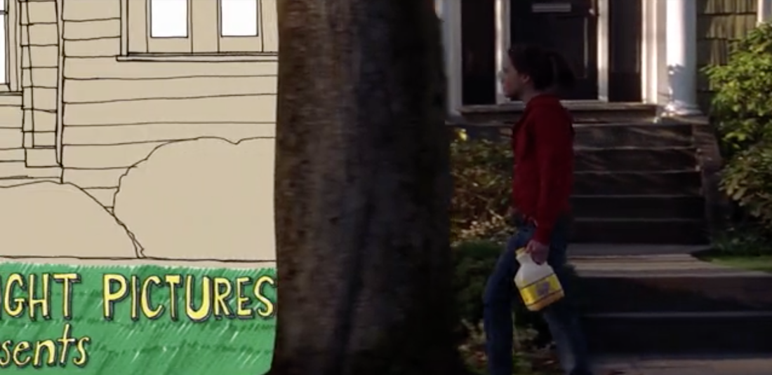
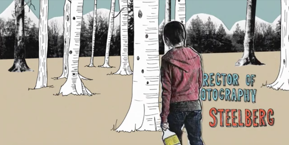
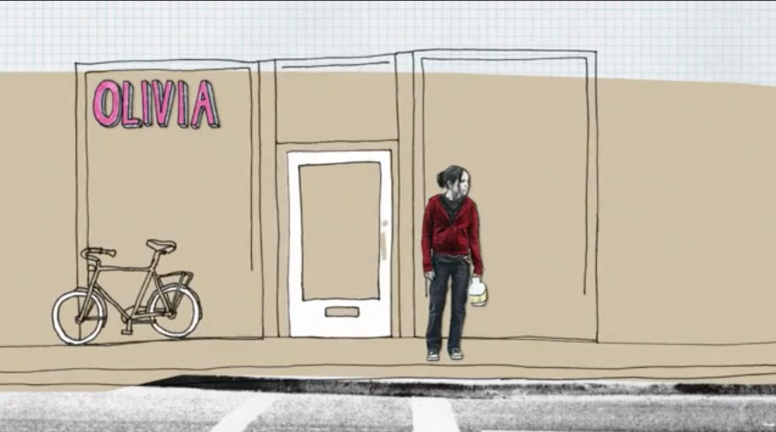
I chose this motion graphic as a reference because I like how the different elements/objects are animated to tell a story as the character walks along. Theres a lot in a shot but not everything is being animated, only the necessary things, so the aesthetics are quite simple and cute, but still effect. Which is what I am going for simple cute aesthetics that can tell a story effectively with the help of key items being animated.
I like how this video uses motion graphics as an interesting and creative approach to introducing what the designer behind it does.
The thing I like most about this video is how the animation and transitions of the typography and vector graphics are synchronised with the beat of the music, making them appear to be dancing.
I chose this video as a reference since it contains a variety of ways that typography can be animated in a motion graphic, since its something I am still confused about in terms of my own motion graphic. However this looks really hard to do, maybe I'll try to mind an easier method, that is still appropriate to my video's topic and context.
searching into saint helena and napoleon.
Napoleon facts:
- He stands at the gangway of Captain Frederick Maitland’s Ship the ‘Bellerophon'.
- After failing at his attempt to dominate Europe failed, Napoleon finally surrendered to the captain, who brought him to England’ after being defeated at the battle of Waterloo on 18 June 1815.
- After Napoleon’s surrender, he was was exiled to the remote island of St Helena, with a small entourage, 5000 miles from Europe. To prevent him from attempting anymore dangerous plots.
- During he’s stay he was active campaigning to be released, and also wrote his autobiography.
- Napoleon passed away 6 years after his exile on 5 May 1821, the cause was reportedly stomach cancer like his father.
- He relaxed in steaming waters in his bathroom, soothing the stress of his captivity.
- Green wallpaper, coloured in Scheele's green and gold, that, when exposed to heat and dampness from his frequent lengthy hot soakings in his deep copper bathtub, would exude arsenical fumes.
- Napoleon appears to have had a Scheele's green and gold bathroom wallpaper.
- Scheele's green wallpaper. It releases arsenical fumes when exposed to heat and dampness from baths.
- Initially he was buried with full military honours in a nameless tomb on St Helena, Londwood. However his body was returned to France in 1840 to be ceremoniously reburied in Les Invalides.
- This is a sketch of Napoleon Bonaparte 14 hours after his death, by Captain Frederick Marryat.
- The inscription on the sketch reads: ‘Napoleon Bonaparte as he appeared on Sunday morning on the 6th of May, 14 hours after his death, laying upon the bed that he died in.’
- Around 4,000 people
- The island is located in the south Atlantic, somewhere west of Cape Town and south of Ascension Island
- The island is largely composed of rugged terrain of volcanic origin. But the last volcanic eruptions occurred about 7 million years ago.
- Twice annual imports from the last working, St Helena Royal Mail Ship.
- Located more than 2,000 km from the nearest major landmass, RMS’s journey takes up to a month.
- During its travels it collects various pre-ordered items needed by the civilians Such as Cars, puppies and sheep which are regularly stocked onto the boat for the return journey.
- The Saints will be queuing up outside the supermarkets when the boat finally arrives and unloads.
- Island’s lack of major industrialisation or chain stores and its unspoilt countryside, allows its nature to flourish
- The RMS St Helena is scheduled to make its last voyage to the island in March 2016
- Building of St Helena Airport - scheduled to open in February 2016
- Ageing population: Many of the younger generation have left St Helena in search of work, in Cape Town or the UK.
- There are excellent medical facilities on the island, however the hospital is unable to support major operations.
- 90% of tourists are OAPs (old age pensioners).
- RMS has tried to attract younger audience by providing a children’s room, small swimming pool and activities (including cricket!).
- Most tourist activities take part in the capital, Jamestown, which include: golf, snorkelling and hiking etc. The tourist guide lists even the post office is listed as an attraction.
- The oldest current resident in the island is Jonathan, a 183-year-old rare Seychelles giant tortoise who lives on Plantation House’s front lawn. He might be the oldest living land creature.
- “He is virtually blind from cataracts, has no sense of smell - but his hearing is good," Joe tells me.
- He might be considered lucky. In Napoleon’s time, sailors routinely captured giant tortoises and stacked them on their backs in their ships where they survived for weeks without food or water. Then, throughout their long voyages, the crew slaughtered them for fresh meat.
- Jonathan, a Boer War prisoner, and a guard, around 1900
- The Saints would like to raise funds for a life-size bronze statue of him.
Research Links:
http://blogs.britannica.com/2009/06/st-helena-the-worlds-best-kept-travel-secret/
http://www.mrodenberg.com/2011/06/17/prisoners-of-st-helena/
http://en.wikipedia.org/wiki/Saint_Helena
http://www.riskyregencies.com/2010/05/16/a-conspiracy-theory-of-napoleonic-proportions/
http://www.bbc.co.uk/news/uk-31945384
http://www.rmg.co.uk/explore/sea-and-ships/in-depth/nelson-and-napoleon/english/aftermath/exile-on-st-helena
http://www.rmg.co.uk/researchers/collections/by-type/archive-and-library/item-of-the-month/previous/capt-marryats-sketch-of-napoleon-bonaparte-after-his-death
http://www.napoleon-series.org/research/napoleon/c_arsenic.html
Initial Storyboard
What is it for?
My motion graphics is targeted at children in primary schools so the information won't be too detailed in order to engage them and fit in with their learning level.
It would be a part of an educational youtube series called Final Destination, the description reads:
This is the first episode of the new Final Destination series.
These series will take a look at the last location important historical figures, spent their last living years in and how they ended up there in the first place.
The vector graphics i created
|
The first stage of making took place in illustrator:
Here is where I created all of the background settings and elements as well as the characters. I wanted them to look simple and cute while still looking like the things and people - especially Napoleon, they were representing. In order to do this the tools I found most useful were the pen tool, shape tool, shape builder tool and the distort and transform effects. When creating my vector graphics, I used a selection of reference images from google for objects, such as the ship that I wasn't sure about when it came to the details. |
The second stage took place in After Effects.
Since I knew that there would be a lot of layers I decide to split my storyboard into 6 sections and work on them separately so that I wouldn't get overwhelmed by all the layers. Another reason is that I had trouble with the amount of keyframes and how to pace the character's movement, when the video was too long, so I separated them. When working on After effects the tool I found most useful was using the null object as a parenting layer, this made animating the different object together a lot easier and allowed them to flow better together. The last stage took place in iMovie. This is where I combined all six parts together and added the sound effects. I also used the aged film video effect and adjusted the colour correction, in order to make the video fit with the historical content and make it look slightly more vintage. |
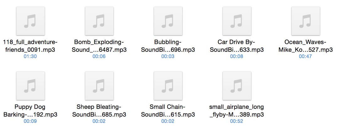
Sounds Used
|
When looking for a background track, I wanted something that was a combination of adventure, cartoony and pirate ship. Luckily the first sound that I came up when I typed adventure into premiumbeat.com was exactly that. From then on I watched my video and looked for any places where sound effects would be suitable, I didn't want to use too much so that it wouldn't become to chaotic an overwhelm the background track. But I had to put some in to make it more enjoyable for children.
|
|
Sound links:
http://www.premiumbeat.com/royalty_free_music/songs/adventure-friends
http://soundbible.com/520-Sheep-Bleating.html
http://soundbible.com/393-Puppy-Dog-Barking.html
http://soundbible.com/1148-Bubbling.html
http://soundbible.com/152-Car-Drive-By.html
http://soundbible.com/1106-Small-Chain.html
http://soundbible.com/1986-Bomb-Exploding.html
http://soundbible.com/1600-Small-Airplane-Long-Flyby.html
http://soundbible.com/1935-Ocean-Waves.html
Initial Version
Final Motion Graphics
Evaluation of dwtd
Dumb Ways to Die is a public service announcement campaign by Metro Trains in, Australia. The aim of the campaign was to reduce the number of accidents with trains, in Australia which was on the rise. The reason for this was found to be the increase of risky behaviour around trains.
The agency McCann Melbourne were the ones behind the creation of the campaign. Chloe Alsop, marketing manager at Metro Trains in Melbourne, mentioned in an interview, that when the team sat down to discuss different ways to not get hit by a train, they found that it turned out to be very difficult and that the person needed to be really careless in order for it to happen. The team also found that children these days are courageous and don’t fear death or just don’t think it will happen to them so soon. What really gets to them is how their friend perceive them, they don’t want them to think they’re stupid.
In addition the team also had the problem of finding a way to turn a rail safety message which was the last thing the audience wanted to hear into something they wanted to hear, especially young people, who are not attracted to traditional style safety messages.
The video went viral through sharing on social media within 2 days of its upload the video had been seen 2.5 million times, reaching 4.7 million on it’s 3rd day. In relation to its popularity and success- it won the Grand Prix in the PR, direct marketing and radio categories at the Cannes Lions, Chloe Alsop explained that "It’s different. It’s cute as hell and it gets stuck in your head. And it’s not until the last three seconds that it is actually telling the consumer to do anything. I think people are immune now to most call to action in advertising unless there's a big incentive.
The campaign appears to have been successful since in achieving its purpose, the operator claimed to have seen a reduction in the period between November to January from 13.29 near-misses to 9.17.
The company continues to keep the campaign alive by releasing seasonal shorts such as valentines, halloween and christmas that continue to incorporate the cute little characters. They have also released a video game that was popular enough to receive a sequel, other merchandise include stuffed toys version of the characters
One of the creators means that she didn't want to shock have gore or negative imagery that would offend. I think that this was a good choice. The reality is already depressing, most people are probably aware of the consequences but rather not think of about them because its unpleasant. I like how they took something negative and visualised it in a way that makes people feel happy watching and gets stuck in there heads throughout the day, instead of feeling uncomfortable, paranoid or change the channel. Through the use of humour and cute characters the reality can still be seen and the message is still transmitted to the people in contact subconsciously.
I also really like the aesthetics of the characters and the situations they are in. They look simple but cute and funny which allows horrible things to happen to them but not look as serious.
evaluation of the 2nd brief
One of the things I enjoyed most about this brief is how I was given chance to work with a topic that I would’t normally choose to work on. This allowed me to learn about interesting things, I previously didn’t know about such as Saint Helena, which I was lucky enough to have an interest in. This allowed me to not be stuck at the start of the brief since I already had a topic in mind, instead of being indecisive and take long to choose.
Another thing I really liked about this brief is that despite it being based around a historical setting, the aesthetics are still open to be in different styles and contexts for different audiences such as a children’s Youtube series, which is what my motion graphic is based on. This also allowed me to work with the simple and cute vectors graphics similar to the ones used on the dumb ways to die motion graphics, which I really liked.
The thing I found most difficult when doing this brief was coming up with an idea. I had interest in my chosen object and subject and had a lot of research into it.However I didn’t now how to put all of these information into a short motion graphic, more specifically how the information would transition and appear and leave the screen. Eventually I came up with the story telling format, after identifying that there were two main characters, Napoleon and Jonathan who could be the ones telling the child about the their life and the island.
While doing my final motion graphic I realised that I had way too much information and that if I incorporated all of the vector graphics I had made, the video would be way too long with too much to take in for young children with short attention spans. Despite shortening my video by taking away some of the vector graphics, I was still unable to get it below 2:40. I thought about ending it after Napoleon’s death but then Jonathan’s character wouldn’t be clear to the audience and there also wouldn’t be any information on Saint Helena.
One thing I liked about my final piece is how the aesthetic’s remain consistent throughout the motion graphics, and how the painting does not disrupt the aesthetic feel of the overall animation, making its appearance subtle. Furthermore the sound effects compliment the graphic style in terms of fitting with the target audience and making it appear cartoony.
Overall this brief helped me develop the skill of adapting to an unknown topic that I am unfamiliar with and finding a way of creating something out of it to meet the brief. I was also able to learn new controls on After effects such as how to create parent layers using null objects which came in handy when moving and editing objects together.
Week 1: Introduction to brief
13/01/2015 - Response to new brief introduction:
My first thought on this brief is that it is quite similar to term 1 regarding the fact that I will need to create an animation. The only difference being that I will now have to done all the work by myself instead of splitting it in a group. Luckily I was responsible for the editing in my previous project which helped my skills on After Effects improve lot, so I am more confident.
I am also thinking of finally incorporating hand draw sketches which I wanted to do previously but couldn't because of a group consensus. However I'm not sure what style yet.
I also think that it might be easier this way since filming real life footage by myself will be difficult since I would have to be the camerawoman, director and possibly the actress or casting person.
Overall I really like the fact that there is so much room for creativity since I have the freedom to come up with my own film idea rather than being restricted by the aesthetics of an existing production. But it might be a bit tricky to make the title sequence an independent representation of the film other than a spoiler or trailer.
Week 2:initial ideas for title sequence
Synopsis:
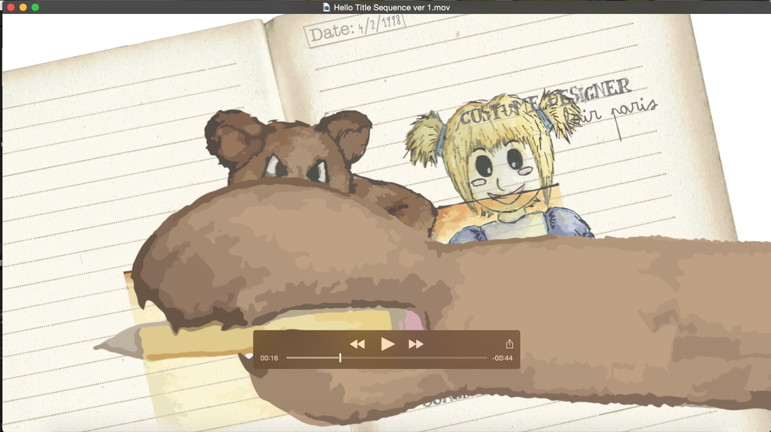
A imaginary friend grows with the child but the lightheartedness and innocence of the imaginary creature develops a dark personality and the now grown child must fight against its influence on her, the best friend turns into the enemy.
The main character doesn’t really have any friends to play with so in order not to feel lonely she develops an imaginary friend. This friend takes the form of her mother’s old childhood Teddy bear. At first the bear can only move and make noises but eventually learns to talk, and the first word it learns is ‘Hello”.The two are inseparable, the child begins to depend on the bear for everything, the bear’s advice and opinions mean a lot to her. The teddy bear which isn’t actually imaginary, realises the influence and power it has over the girl's life and it sees this as an opportunity to takeover the daughter’s place and gain the mothers attention again, which was lost after the mother moved to University.
Week 3: Research for title sequence
26/01/15 Possible Aesthetic Feel and Outcome:
- The opening title sequence will be a contrast of happy and innocent with dark and evil imagery and typeface. It will symbolise the lighthearted nature of their friendship developing into something dark. The light will be competing with the dark and there will be some take over through, masking and fading.
- The name of the film will be Hello, the ‘O’ will be scratched out or smudged by a bear's paw , or maybe just fade to show the words ‘Hell ’ instead symbolising that the bear presence will turn her life into a living nightmare.
- Part illustration, part real life footage and photography. This will represent the theme of what is fantasy and what is reality in the movie, since the child can't deferential between the two in terms of 'Hello' teddy.
- The illustrations will not give away the fact that the imaginary friend isn't imaginary, since it is an important detail of the story, the climax of the film would be the reveal. The drawings used could be the child’s documentation of her interactions with the bear, a record of the bear’s existence in her mind since she thinks its all imagination.
- Writing and rubbing out by the bear to show that the bear is interfering and influencing the child’s documentation of what happened.
- The genre of my film is a cross between family film and a thriller which develops into a something supernatural.
- The rating will probably be PG or 12, so that older children or young teens can still watch. However that would depend on what footage my film would have which is something I would be more certain about if I was actually making a short film. Right now I am leaning more towards 12.
12 Rating - Specifications that apply to my potential film:
-Frightening scenes can contain a reasonable amount of physical and psychological threat. However scenes that are disturbing should remain infrequent and relatively short.
-Scenes where dangerous behaviour which can be copied by the public are present e.g self-harming and suicide. Must be short and without much detail. Issues present in these scenes cannot be portrayed in a way that makes them seem harm free and painless. Weapons that can be easily accessed should not be glamorised.
-Moderate violence can be used but these scenes should not dwell on detail. Gory parts can be included if justified by context. However there should not be an exaggerated use of blood and focus on injuries suffered by characters.
http://www.bbfc.co.uk/what-classification/12a-and-12
Title Sequence references:
27/01/15 - Below are some references that I found interesting and have caught my attention in relation to possible connections with, and inspirations for my own story and initial ideas. Some I have seen before coming up with these ideas and others I saw afterwards, but all have contributed in some way to me arriving at my current ideas and will possible help future changes as well.
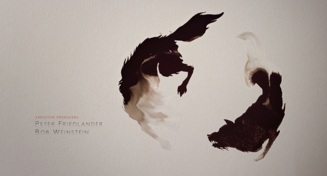
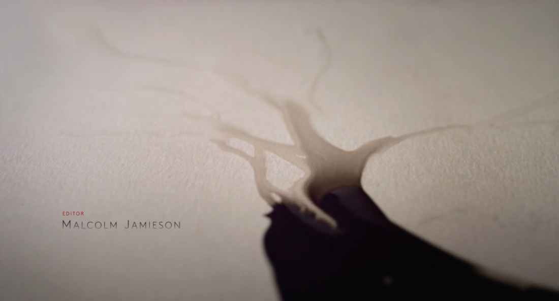
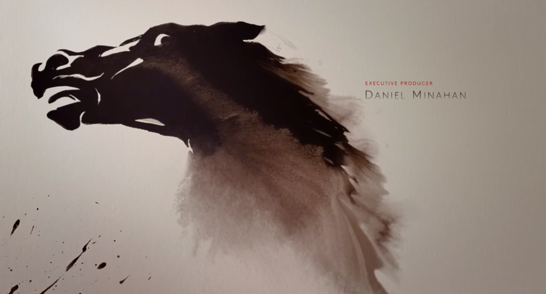
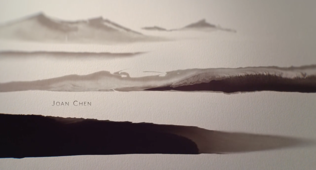
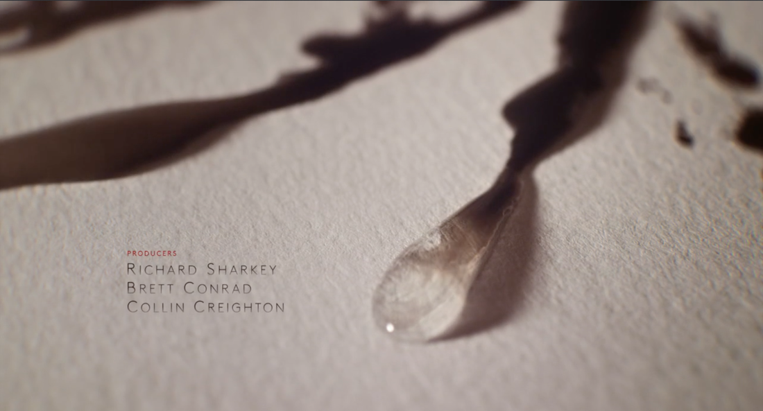
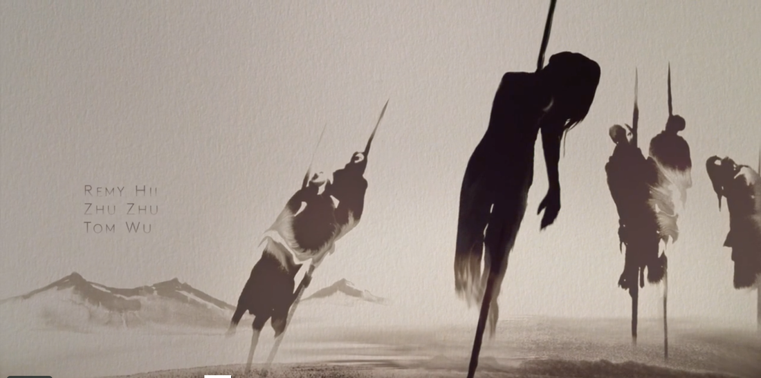
Marco Polo
|
I like the way that the drawings are already created with water, but only reveal themselves slowly when the ink is added, it creates a natural transition and masking of the image. The close ups used to show the ink spreading allows the texture of the page to be seen and because of the rough surface the ink flow is given an organic appearance.
I also like the effects created by the ink medium such as how the ink flow creates a sense of movement and life to the imagery for example the shot of the horse and it’s mane and the flag. Additionally the different tones of grey created by the different concentrations of black ink on the wet surface create a sense of depth and gives the drawings a natural and subtle detailing specially for the landscape. The close up of the water droplet enhances the sense of life because of its 3D appearance and reinforces the natural aesthetic style of the paintings. The images are shot in a way that makes them seem hand made, but I think that there are some shots that were made digitally for example the shot of the pierced bodies, since the image doesn’t appear on the screen the same way as the rest. Similarly a black and white gradient effect is added to the credits text to reflect the colours and fading of the ink in the background. This link is reinforced further through the fact that the series title contains jagged edges similar organic appearance created by when the ink spreads onto the textured paper. I like how the end shot of the film title is painted to look like a 3D landscape. Most of the canvas is black, the only sign of the paper is the trail that goes from the army in the distance towards and of the screen. The music suits the setting of the movie which is China, as well as the eastern asian aesthetic created by the title sequence since it uses inks that resemble Chinese calligraphy. Overall this title sequence caught my attention because of its hand drawn aesthetics since I am thinking of adding drawings to my title sequence. This example gave me an interesting approach to how the images might appear on screen and also allowed me to see how images can be created on camera rather than beforehand. http://www.artofthetitle.com/title/marco-polo/ 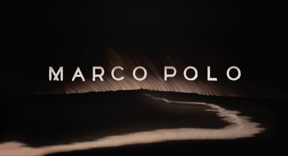
|
|
Little Shop Of Horrors
|
I like how the images/stamps in the beginning of the title sequence appear and disappear in synch with the background music to match the timing of the drums being hit, since it creates a dramatic effect.
Another thing I enjoy about this title sequence is how a long panoramic sketched representation of the town is used to introduce the setting of the film. The camera pans to the right to reveal and take the viewer through the different buildings and sceneries which is a more effective way to show the town since all the different detail in the foreground and background can be seen such as the shop and street names. This effectiveness of this introduction is further supported by a voiceover by a sergeant working on a homicide that informs the viewers about the town and its dangers. http://www.artofthetitle.com/title/the-little-shop-of-horrors/ |
The reason why this particular title sequence caught my attention was because of its simple yet effective approach. Its basically a long drawing that moves a cross the page, but the level of detail and sound makes it work.
|
Juno
|
One of the things I really like about this title sequence is how it merges real life footage with cartoon illustrations of the real world. The variety of different camera shots and angles used such as low angle and point of view shots make the journey of the character to her house more interesting.The transition was also very smooth, she goes behind the tree and enters into cartoon world.
Additionally I like how the illustration goes beyond just a drawing and incorporates elements of collage so that different textures can be seen making the scenes more interesting. Type in this case is part of that collage since it appears to be 3D compared to the flat background. In relation to the type I like how it doesn’t stay the same throughout the scene, the font is the same however the way it interacts with the scene changes, such as changing colour constantly in one shot, being part of the building in the background in another, or appearing as Juno walks across the screen. Type in this example isn’t just superimposed like in ‘Little Shop Of Horrors” or an additional layer like in ‘Marco Polo’ In this title sequence the text is part of the overall image and interacts with it. The style of illustration also helps to represent the film since it looks rough and sketchy, which resembles workbook doodles and gives of a sense of not being strict and by the book which would instead be presented by a carefully measured out, neat drawings. This relates to the film because it deals with the topic of teenage pregnancy. |
|
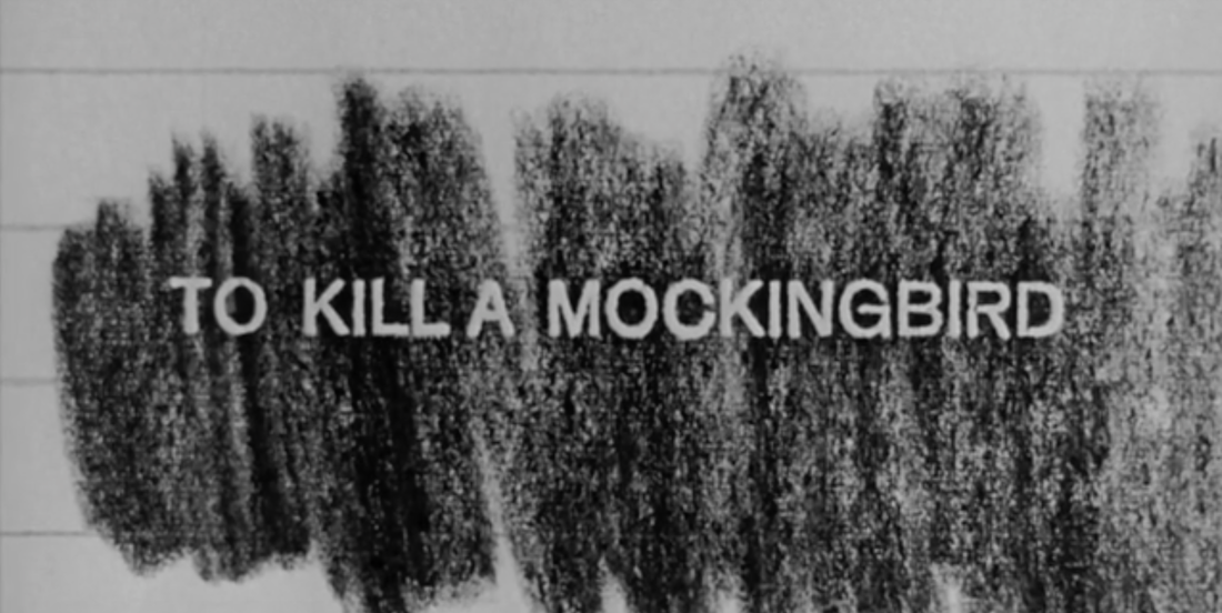
To Kill A Mockingbird
|
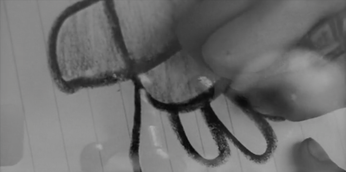
I like how at the beginning of the title sequence only a child humming can be heard, this alongside the black and white close ups of antique objects created an eerie atmosphere, which later brightened up a bit with the addition of the background music.
The eerie effect is relevant to my own story since its a supernatural/horror where focusing on objects such as toys(teddy bear) and stationary(drawing) would work well for my own title sequence. What I like most about this is how the child is never shown, all we see is the hands drawing and interacting with the objects as well as the humming other than that the child’s identity remains hidden. This gives a helpful tip for me since my film’s main character is a young child, which is a problem for me since I don’t know any young children. Adding smaller hands would still be a difficult but this title sequence showed me that I can use traces of a child’s existence to indicate their presence without actually showing them. |
|
True Detective
|
This title sequence caught my attention because of it’s prominent use of masks and layering which helps create a sense of nostalgia while telling a story without being completely transparent about the narrative of the series.
The soft edges/ colours and high key lighting present in most of the shots causes the images to appear like they are fragments of a dream or memory. Overall this title sequence gave me a useful insight into how I could go about showing the change in personality of the teddy bear and its relationship with the main character throughout the film from good to bad. http://www.artofthetitle.com/title/true-detective/ |
|
TED
|
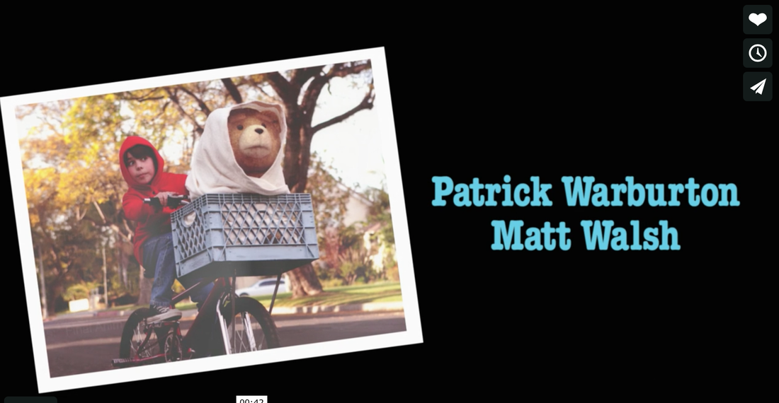
Since my film consists of an imaginary friend that manifests into a teddy bear which is actually not imaginary, I decided to look into a similar existing example, Ted.
Despite being a completely different genre from my film. The title sequence still does a good job of representing through photographs and short clips the relationship of Ted with the main character and the journey they shared together as they grew up. This a approach might work with my story however, rather than showing the teddy bears journey with the main character, it would instead be its history with family until now since it belonged to the mom previously. |
|
|
It's Okay Thats Love
This Korean drama along with Ted helped inspire my film synopsis. In short the main character of the drama has a best friend who is a student who he cares very deeply for and who he wants to protect since the teen is going through the same physical abuse from his aggressive father that the main character experienced. In the end he finds out that the teen is actually an imaginary representation of himself created by his schizophrenia (he doesn't know he has) to deal with his trauma. |
|
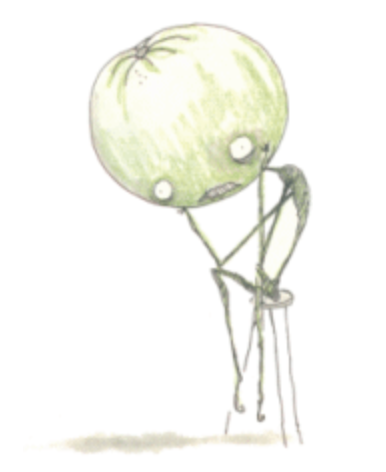
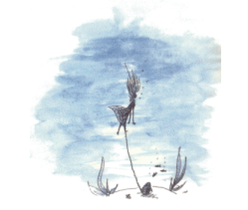
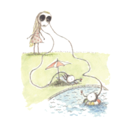
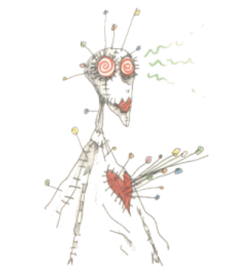
Tim Burton - The Melancholy Death of Oyster Boy: And Other Stories
|
This book was recommend to me by my tutor. When I began thinking about what kind of drawings and style I could use, that would suit well with my film.
After finding a copy online, I thought that it would be easier to understand the sketches and why they were drawn that way if I read the poems. So, I read through all of them and gave my interpretation to the ones I could understand better, regarding what it was about. I came to the conclusion that they each had a double meaning although it might not be so clear. For example Voodoo girl seems as if she has some emotional trauma that prevents her from trusting others which is why when "someone gets too close to her, the pins stick farther in", so the pins might be a defence mechanism. Junk Girl is lightly darker than the previous one. Since it appears to be dealing with suicide. "He loved her a lot and made a marriage proposal, but she already thrown herself in the garbage disposal" Staring girl also ends in a depressing way "she finally gave her eyes a well-deserved rest." which probably means she's dead. http://homepage.tinet.ie/~sebulbac/burton/voodoogirl.html http://homepage.tinet.ie/~sebulbac/burton/junkgirl.html http://homepage.tinet.ie/~sebulbac/burton/staringgirl.html |
Overall what I found out about these drawings through reading the poems is that, they are simple yet detailed and cute yet dark, because of the double meanings in the poems.
I also found out that these drawings are done using watercolour which I think is very suitable. The idea that the paint has to be carefully applied so that it doesn't bleed over the lines, and that the drawings can be ruined if water spills over them, it helps to reflect how fragile life is or the sadness of these poems. |
Week 2+4: After Effects workshops
20/01/15 - Week 2: Basics of after Effects- Masking and editing masks-
In this tutorial I learned about different ways I could used masking in a more interesting way. Previously I had only used masking to cover areas without animating them but now I can apply feather to the edges as well as move them about. This was a very useful workshop for me specially since its a tool that could help me convey my story in a more effective way specially since I thinking about working with good vs evil taking over each other so masking one thing with the other seems like a good idea.
I also found it really interesting how text can be animated to appear and disappear using masks, which mean that instead of using default settings, I can make my own now.
It's also not very hard to do, I just have to pay attention to the timing, since t doesn't work very well if its too slow like my test example.
3/02/15 - Week 4: Parallax Effect- This was a more challenging workshop. I learned how to make 2D images appear 3D. I found it really confusing since I had never done this before, I don't think I will be incorporating this technique into my animation since I'm not very confident with it, but nevertheless it was still really interesting.
WEEK 5: Gathering all elements for my title sequence
Since one of my initial ideas was to mix real-life photos with sketches I decided to look for suitable royalty-free photographs online.
Right now I am not too sure about the composition and full content of my title sequence, so I decided to look for interesting teddy bear imagery. I ended up finding a bear that looked quite creepy (6) but I'm not sure if I will be using a real teddy bear yet, but I leaving that possibility open.
I also looked into backgrounds. Which led to me searching for locations where the child and teddy bear might spend time in and I arrived at a final 5 images (1-5), which include - Bedroom, playground,kitchen, classroom, and living room.
Since I will be incorporating watercolour drawings I thought about whether these locations would go well with them. So I decided to apply the same effect I added to my sketches which is the trace option to the photographs, however this time instead of making them low fidelity photos I used the 16 colours option.
The equipment I used.
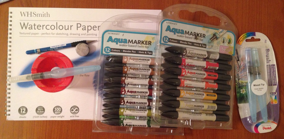
16 & 17/02/15 - Creating my sketches:
Today I have finally finished drawing, painting and outlining my sketches after splitting them half-half. When creating my sketches I was inspired by Tim Burton's work (see reference post). However I didn't want to make them look too creepy or dark so I decided to just make the bear eye's triangular to show he's evil but, the girl also looks kind of creepy since she is always smiling even when something bad is happening e.g her blocks town is knocked over. I decided to use watercolours since it can be considered a delicate medium which would go well with the initial lightheartedness of my film, as well as the fact that it would mostly, take place in the girl's childhood. Like Tim Burton I also tried to make the draws look simple while still maintaining the necessary details such as making her appear older. |
This was also important because it was suppose to be inspired by a child's drawing so it couldn't be perfect but it also couldn't look too messy are else it would lose detail.
I also decided to outline the sketches with a black fine liner in order to better distinguish between the physical beings who are drawing the sketches (the girl and teddy bear)which do not have an outline. The outline also helped maintain detail when scanning the drawings and tracing them on illustrator. |
|
Choosing a font:
By searching for a suitable font for my title sequence, I came across many but I narrowed it down to my top 4: 1)Blackboard: This font has a nice balance. It doesn't look scary but it doesn't seem calm either. It looks as if someone wrote it in a hurry, maybe because they were impatient. It also seems a bit rebellious. http://www.dafont.com/blackboard.font? 2)El font ghotic: This font seems angry and out of control, I think maybe its a bit too much for my story. text=Hello&back=themehttp://www.dafont.com/el-font-gohtic.font?text=Hello 3)dk lemon yellow sun: This font seems carefree, cute and playful, it would go well for a child's handwriting. http://www.dafont.com/dk-lemon-yellow-sun.font?text=Hello 4)Arsenale: This font looks cute and playful which would also be a good choice for a child's writing. http://www.dafont.com/arsenale-white.font?text=Hello Overall I think that font 1 would represent the Teddy bear's character well, since he is becoming more impatient and revealing his real self. Because of this I choose the 4th one for the child since it offers a better contrast with the Teddy's typeface. |
From the start I knew I needed two fonts to represent the personalty and role of the two main characters.
The film title doesn't need a font since it will be painted and allowed to form randomly with watercolour. 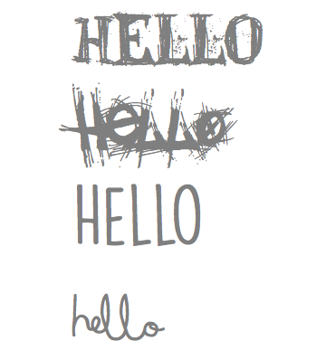
|
|
16/02/15 - Creating a ink effect:
Today I tried to create the effect of ink flowing through the page, which was inspired by the Marco Polo title sequence. I think that the way the ink flows in addition to the added filters and effects applied to it, it could be a good representative of the bear's spirit. However as you can see in the footage. It didn't really work very well, maybe some parts could work if cropped but the reflection of the lamp ruined half of the it. So after my failed attempt I tried to look for something online and came across the video below. |
|
Judging from the comments under the video the uploader doesn't mind people using the video for projects so I might use it as well.
|
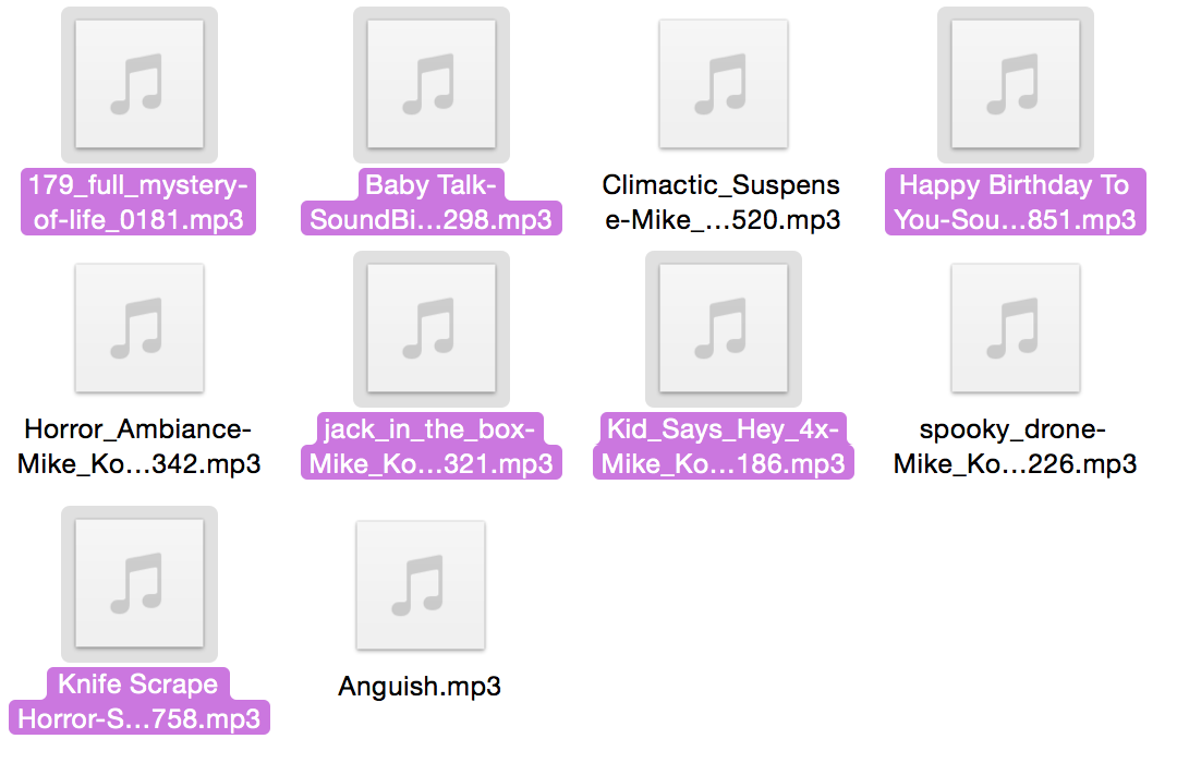
Sound Effects and Music:
On the right, all of the purple sounds are the ones I have used on my final film title sequence. The jack in the box and happy birthday songs were chosen because of their relation to childhood and innocence. This in addition to the music 'Mystery of life' allows the sounds to appear soft yet frightening, its less expected then an intentionally scary music/sound which I used for my tester, which makes it more chilling It also goes better with my overall film. The baby talk, and Kid saying hey, is representative of the Teddy bear's and Child's interactions. |
|
Sound links:
http://www.premiumbeat.com/royalty_free_music/songs/mystery-of-lifehttp://soundbible.com/421-Happy-Birthday-To-You.html
http://soundbible.com/1872-Jack-In-The-Box.html
http://soundbible.com/2013-Kid-Says-Hey-4x.html
http://soundbible.com/1784-Baby-Talk.html
http://soundbible.com/405-Knife-Scrape-Horror.html
Week 6: Creating final Title Sequence
16/02/15 - "Hello" Title Sequence Experimentation Feedback
Today I showed both of my tutors a tester I created using After Effects and iMovie for my Title Sequence, in order to receive feedback and guidance regarding what path to take.
When creating this tester I was trying to put everything I had into one video, and combine all of my ideas, so that when I showed my tutors they would highlight the elements that worked best and had the most potential.
The feedback I received was that:
- The bear paw entering the shot was way too slow: So I am going to have to pay for attention to the number of actor points I used as well as the distance between them, and test for timing.
- My drawings looked nice and worked well. At this point I only had half of them done since I didn't know if I should continue making them.
- There was too much going on, which made it hard to focus on just one thing. I should try using a minimalistic approach, sometimes, less is more but making it work can be hard. Listening to this I decided to cut out the real life teddy bear layer as well as the real life background since it wasn't really necessary and made the footage appear way to messy and crowded.
- The dark colours also made things hard to see, there are too many tones. So I am going to make the ink a different lighter colour instead.
Initial Storyboard for "Hello" Film Title Sequence
After receiving the feedback for my tester I was finally able to finalise an idea for my final title sequence and transfer those thoughts into sketches for my storyboard.
Editing stages
The first image above shows the final watercolour sketches after they had been traced using the low fidelity option on Illustrator.
The second image shows what the initial sketches I was going to used looked like, however because I used the 16 colours trace option, a lot of the colours and details I took my time colouring were lost making the drawings appear lifeless. However the paw hand and print were still suitable for use in my film.
The second image shows what the initial sketches I was going to used looked like, however because I used the 16 colours trace option, a lot of the colours and details I took my time colouring were lost making the drawings appear lifeless. However the paw hand and print were still suitable for use in my film.
|
The first stage of editing took place in Photoshop:
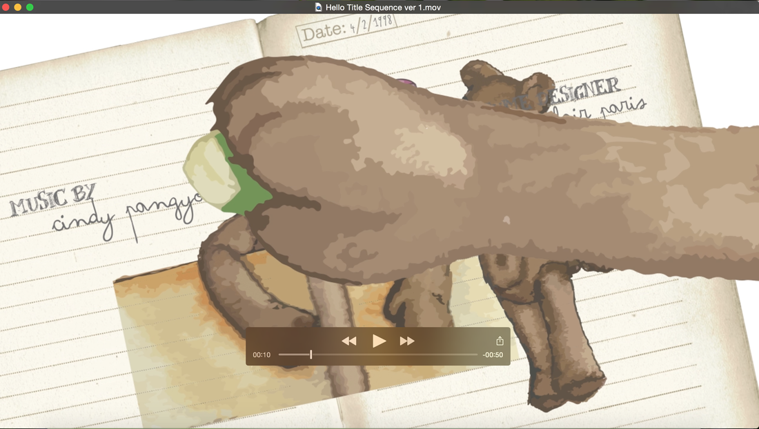
After tracing my sketches I opened them onto photoshop and began removing the background[1->] on each image using the wand tool, as well as adding any extra details that might have been lost, such as the teddy bear's belly bottom, which wasn't on all sketches, preventing his character from remaining consistent. Another thing I did was to enlarge the arm of the first paw I did since it was shorter than the rest. I did this by using the selection tool and pressing the arrow key while holding down the alt key. I also selected parts of the fur and copied them to place onto the arm surface to make the texture more consistent with the paw. After I was done I traced it again on illustrator.[2->] I also arranged the compositions of each frame for my title sequence, in order to speed up the editing process on after effects.[3->] This included typing up all of the credits [4->], which I got from looking at what kind of information the Batman title sequence included. I also merged the dates on to each page so that they wouldn't move around and remain on the same place.[5->] The dates are important since they help determine more or less the age of the child which works hand in hand with the drawings since they show the child getting older. Different book pages were also used to represent time passing. |
[6] I also applied three coats of colours on top of my sketches using the colour replacement tool. Grey, and two different tones of red.
This was to make the large sketches that will go on top of the rest appear more scary. |
The second stage of editing took place on After Effects:
I had to use a lot of anchor points in order to get the movement and speed of the rubbing out and drawing in my title sequence right. The first screenshot shows the orange movements that the human hand follows in and out of the shot.
Masking played a really important role in my title sequence, so I was really happy to learn about it during the workshops, especially when it came to the 'mask path' tool. The second screenshot shows the shape of one of my masks.
The third screenshot shows a combination of both masks and anchor points for the arm movement. Here I am trying to reveal one image while hiding another to make it seem as if the top one is being rubbed out by the bear. You can also see that the images are slightly transparent, this is because I added the 'darken' effect to make them blend into the texture of the pages and feel more part on them.
I also tried to make it more interesting by changing the placement of the drawings in each page instead of always placing them on the same location.
Number 5 shows me trying to make both paws the same size so that it remains consistent throughout and look like its the same bear.
Number 7 shows the Introduction of a new element, and enlarged version of the drawings on the page without any effect. I decided to add this as an attempt at making my title sequence appear creepier. It also symbolises the fact that the issue is bigger than it seems, the drawings are coming to life out of the book, fantasy is turning into reality.
Number 8 shows the big drawing with the 'Exclusive' effect.
Number 9 shows me resizing one of the elements in my title sequence, which I had to do a lot, almost every drawings was too big which was quite time consuming.
I also added two adjustment layers (10,11), a red tint and also the brightness and contrast. This was another attempt at making my title sequence appear more scary.
Number 12 shows the addition of the ink video to my title sequence without any editing, it appears red because I placed it under the red tint layer.
Number 13 shows the ink video with the 'classic colour burn' effect. This allowed it to appear subtle and helped it symbolise better the idea that the bear has something dark inside it.
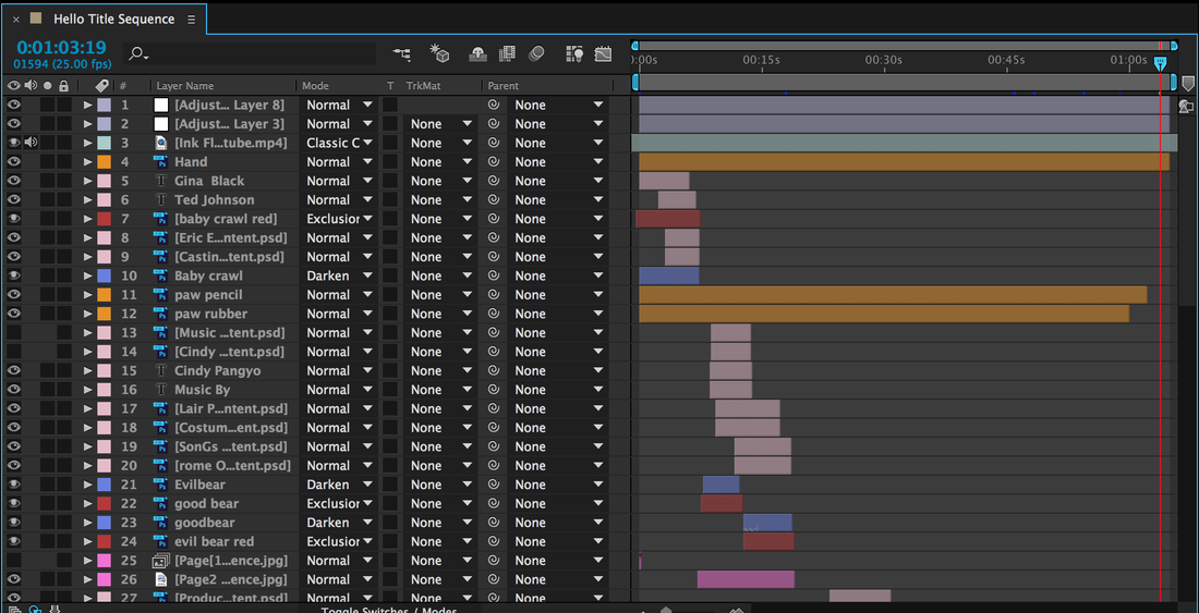
Since my title sequence required a lot of layers, I followed my tutor's advice and colour coded everything to make it easier to find things.
Fuchsia is for the pages, light purple is for the adjustment layers, red for the big sketches, orange is for the hands drawings, pink is for the text, blue is for the drawings and light green is for ink video.
Fuchsia is for the pages, light purple is for the adjustment layers, red for the big sketches, orange is for the hands drawings, pink is for the text, blue is for the drawings and light green is for ink video.
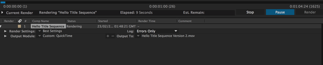
Throughout the editing process I had to render my video many times in order to check for timing and mistakes. Above are some of the mistakes I encountered.
|
The final stage of editing took place in iMovie:
This is where I added sound to my video. I could have done it on After Effects but I find iMovie more straightforward and easier to use. Especially since my After Effects file already had so many layers. I also played around with the levels to make the film appear slightly more darker, making the colours less soft and light. I also added the Vignette video effect, to add focus to the middle of the screen where the action was taking place, the shadow at the edges could symbolise the darkness surrounding both of the character. Another thing I used this software for was to add transitions, one at the start and one as the end so that the video would enter and leave the screen smoothly. I also added the University logo, to show that its a student project. |
|
21/02/15 - "Hello" Title Sequence [First Draft]
Above is my title sequence without any of the filters sounds or extra elements that made the final appear more scary, which is why I called it the happy version, since as it is, it doesn't appear very threatening.
Week 7: Final "Hello" Film Title Sequence
Director's Cut [no credits]
Full Version
22/02/15 - Today I have finally completed the final version of my "Hello" Film Title Sequence.
Final Storyboard for "Hello" Film Title Sequence
Evaluation of first brief
One of the things I really liked about this brief is that there wasn’t really a right or wrong answer when it came to coming up with ideas and putting them into action. I had the option to use whatever method I wanted to as long as it had a purpose and related to my film synopsis. Similarly because this was an individual project my options were even more open and I had a lot more freedom to do what I wanted unlike the previous group project.
However there was a difficulty with having to do everything on my own, which I overcame. The problem was me having to play all of the roles. Initially I worried about it being a real life footage film, since it would involve me filming, setting up, casting, acting. But I solved this by minimising all of this roles into just being and illustrator and editor, this allowed all of the other roles to either not be needed or be done digitally.
Some things I found easy were, coming up with the film synopsis. I was happy with not having to use an existing film but worried at first about what the story could be and what genre. However the idea came to me naturally after watching Ted and a Korean drama called It’s okay thats love, which I wrote about in my blog. I decided to combine the two main elements of both medias and turn them into a horror, since I had already previously done a horror film project in A levels.
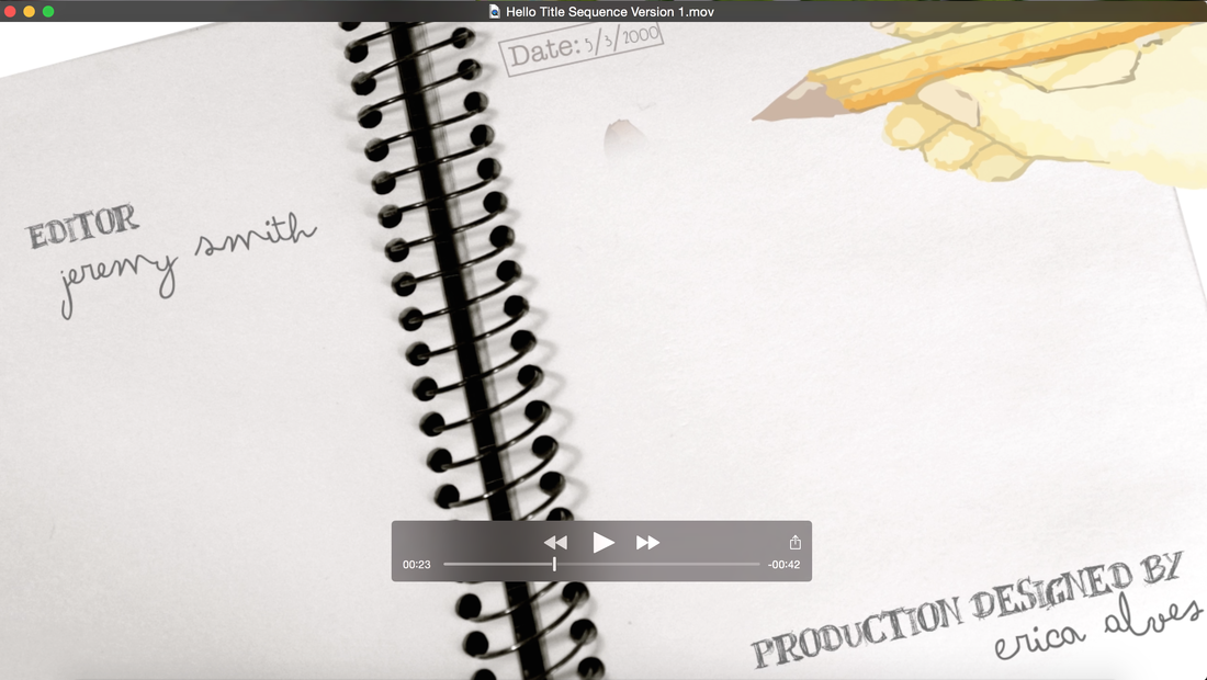
The things I liked about my final title sequence was firstly, my choice of font, I think both of them work really well together and do a good job at representing each character. I also really liked how the sound of the jack in the box popping out is synchronised with the appearance of 'production designed by' at 0:23. Similarly the tone of the background music goes really well with the smooth and subtle movements of the ink overlay. Which created a calming mood for the film, which helped symbolise that the calm before the storm. Additionally I think I used masking effectively. The way the drawings appear and disappear when the hands move across the page is in synch for 90% of the time and it really looks like it is being drawn by the characters.
On the other hand, If I had more time the things I would improve are firstly, the background music since it seems to stutter in some parts rather than flowing smoothly. This is because I had to remove the 'premiumbeat.com' jingle from it. Next time I would try to find another sound or maybe try to edit it better, since I really like this song, I think it goes well with my imagery. Another thing I found was that it’s kind of hard to see the 'co-produced by' credit at 0:39. I should have made it slightly lighter.
Additionally the speed of the hands towards the end of the video gets too fast, I tried spreading the anchor points but it didn't really work, although it was a lot faster before, and lastly the colour of the two bear hands at the end don't match I should have edited it tomato them more compatible.
Overall this brief really helped me become more confident in myself instead of doubting if my ideas will work or if they are good, since there was no time for that, I had to trust myself and get on with it. It also helped improve my skills on After Effects.
However there was a difficulty with having to do everything on my own, which I overcame. The problem was me having to play all of the roles. Initially I worried about it being a real life footage film, since it would involve me filming, setting up, casting, acting. But I solved this by minimising all of this roles into just being and illustrator and editor, this allowed all of the other roles to either not be needed or be done digitally.
Some things I found easy were, coming up with the film synopsis. I was happy with not having to use an existing film but worried at first about what the story could be and what genre. However the idea came to me naturally after watching Ted and a Korean drama called It’s okay thats love, which I wrote about in my blog. I decided to combine the two main elements of both medias and turn them into a horror, since I had already previously done a horror film project in A levels.
The things I liked about my final title sequence was firstly, my choice of font, I think both of them work really well together and do a good job at representing each character. I also really liked how the sound of the jack in the box popping out is synchronised with the appearance of 'production designed by' at 0:23. Similarly the tone of the background music goes really well with the smooth and subtle movements of the ink overlay. Which created a calming mood for the film, which helped symbolise that the calm before the storm. Additionally I think I used masking effectively. The way the drawings appear and disappear when the hands move across the page is in synch for 90% of the time and it really looks like it is being drawn by the characters.
On the other hand, If I had more time the things I would improve are firstly, the background music since it seems to stutter in some parts rather than flowing smoothly. This is because I had to remove the 'premiumbeat.com' jingle from it. Next time I would try to find another sound or maybe try to edit it better, since I really like this song, I think it goes well with my imagery. Another thing I found was that it’s kind of hard to see the 'co-produced by' credit at 0:39. I should have made it slightly lighter.
Additionally the speed of the hands towards the end of the video gets too fast, I tried spreading the anchor points but it didn't really work, although it was a lot faster before, and lastly the colour of the two bear hands at the end don't match I should have edited it tomato them more compatible.
Overall this brief really helped me become more confident in myself instead of doubting if my ideas will work or if they are good, since there was no time for that, I had to trust myself and get on with it. It also helped improve my skills on After Effects.
